rise of the stylish renter
You don’t need to be on the property ladder to make a house a home. We meet the new breed of renters who aren’t afraid to invest in their four walls
Field Of Vision
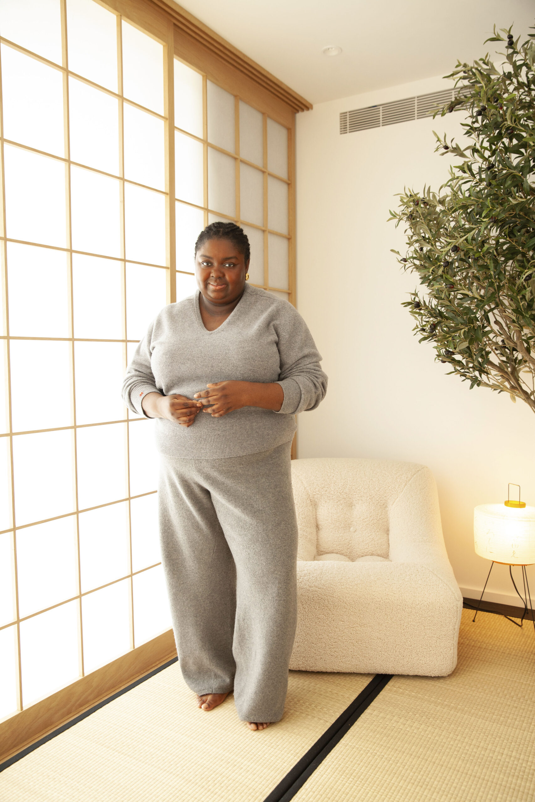
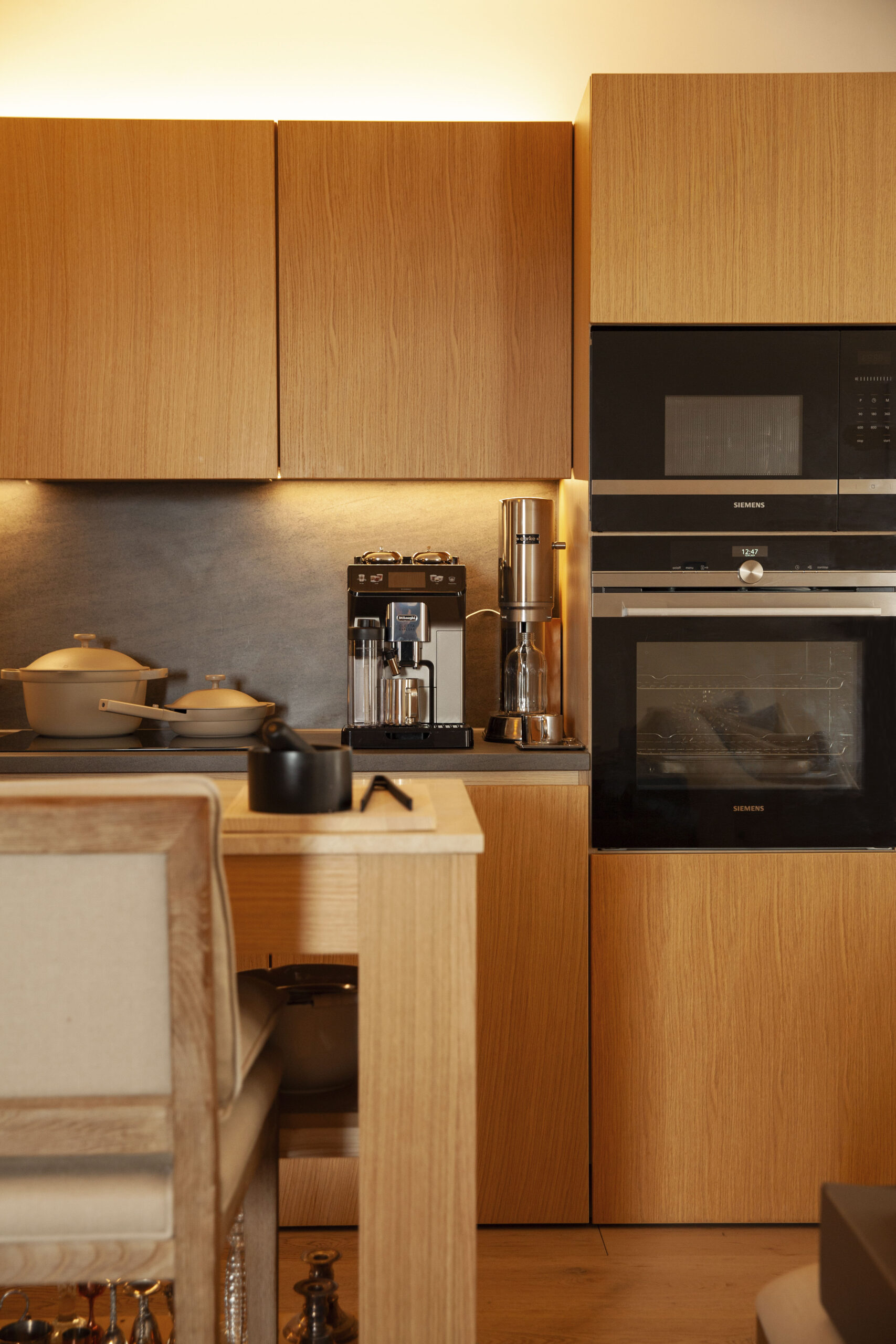
Abisola Omole ‘removed everything’ and created a meditation room (above), while the kitchen (below) has a movable island
NEUTRAL ZONE
When Abisola Omole moved into her furnished apartment last October, she removed pretty much everything in it. A new-build in a block of 60, she liked its design foundations – whitewashed oak floors, warm oak cabinetry and slate in the bathrooms – but the decor ‘was kinda boring, lacked warmth and felt like someone was following a basic blueprint rather than thinking of what residents would actually need in their spaces’, says Omole, creative director and founder of lifestyle brand Studio Arva. ‘So I removed everything, from light fixtures to furniture to the occasional wardrobe door. I wanted to make the place my own and I had a very strong vision.’
That vision was to create a serene and inspiring home. ‘I created mood boards and featured elements I knew would either help me feel calm or inspire me daily, focusing on fabrics and pieces I knew would evoke those feelings,’ she says. ‘From my linen sofas to cashmere cushions, oak headboards and canvas-based artwork, I made sure everything felt in unison from a sensory point of view.’
‘Everything feels in unison, sensory-wise’
The apartment mixes vintage with modern pieces that are both designer and affordable. ‘If you set a tone for your home, whenever you see cool things, you can ask yourself whether it fits how you want your space to feel,’ she says. ‘It stops you buying pieces you don’t need. But don’t shy away from nice pieces just because you think your home’s temporary, either. You can take most things with you.’
While the kitchen is fitted, Omole has added her own touch with a kitchen island on wheels that houses her ceramics collection. In her bedroom, a bespoke wraparound oak headboard gives a cocooning effect, while two Ferm Living glass sideboards are used to store her shoe collection. ‘My bedroom easily feels like a chic hotel room, so waking up there every day never gets old,’ she says.
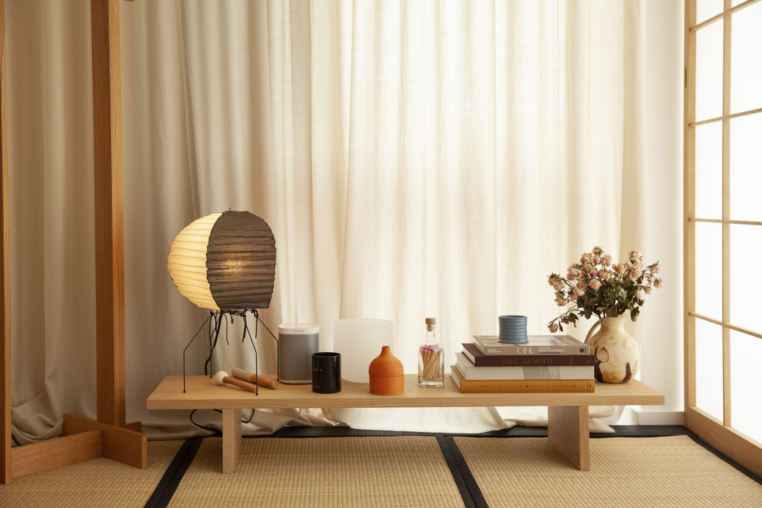
Perhaps the most inspiring part of her home is the Japanese-themed meditation room, formerly a bedroom, that’s an oasis of calm with shoji screen walls (held in place with tracking rails attached with pins and double-sided tape), tatami mats underfoot and a beautifully sculptural faux olive tree. ‘It’s a room I never anticipated I’d ever have, so it’s all kinds of special,’ she says. ‘I love how I feel when I’m in it.’
Cool, Calm & Collected
Omole says of her Japanese-themed meditation room, ‘it’s all kinds of special’
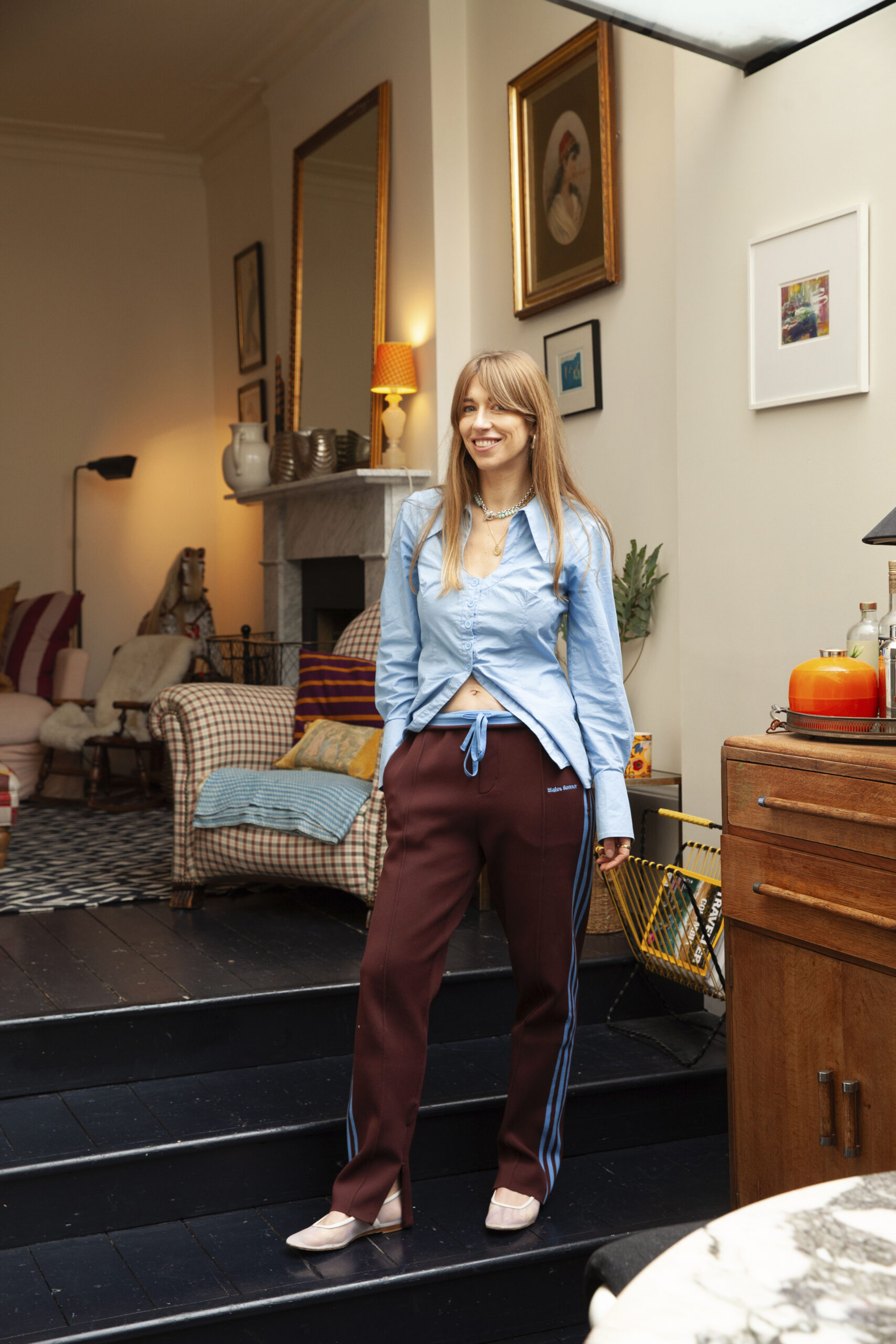
Eclectic Charm
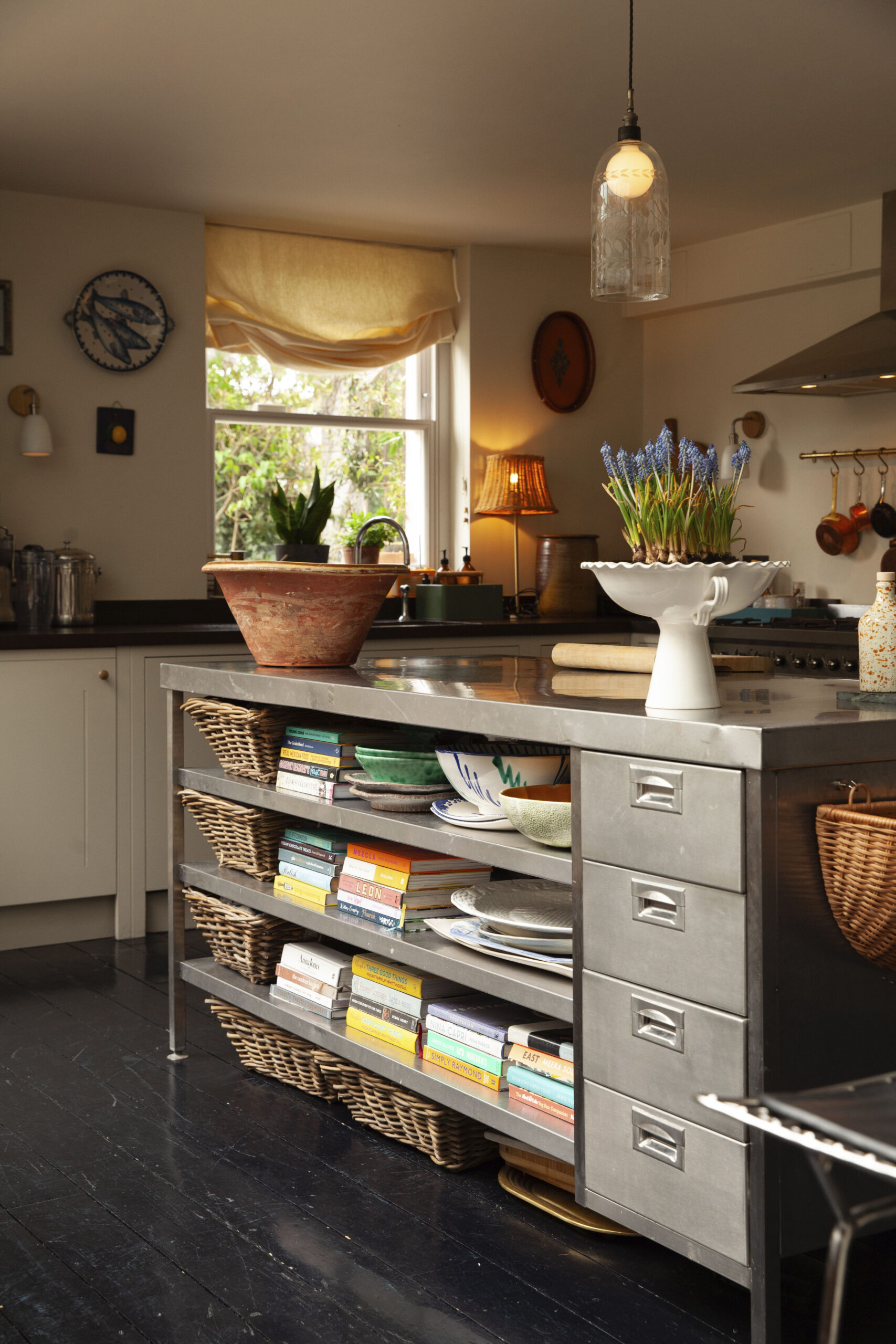
A huge stainless steel island is the focal point of Harriet Haskell-Thomas’s kitchen (above). In the lounge (below), contrasting prints and old furniture create a cosy ambience
MODERN MIX
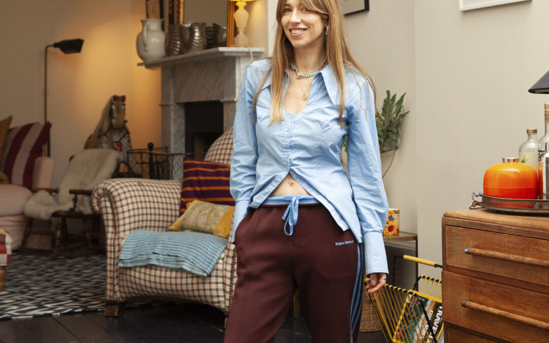
It may have meant taking out the front door and asking friends to give up their Sunday morning to help heave the 500kg stainless-steel kitchen island over a fence, but for stylist Harriet Haskell-Thomas (@harrietstewart), it was worth the effort. ‘The kitchen is a great size but was crying out for an island,’ she says. ‘It was being sold by a pub on eBay and it was a steal. And, because it’s not permanent, we can take it with us – if we can get it out! It’s home to all my ceramics, as well as being a great prep space and good for hosting a crowd.’
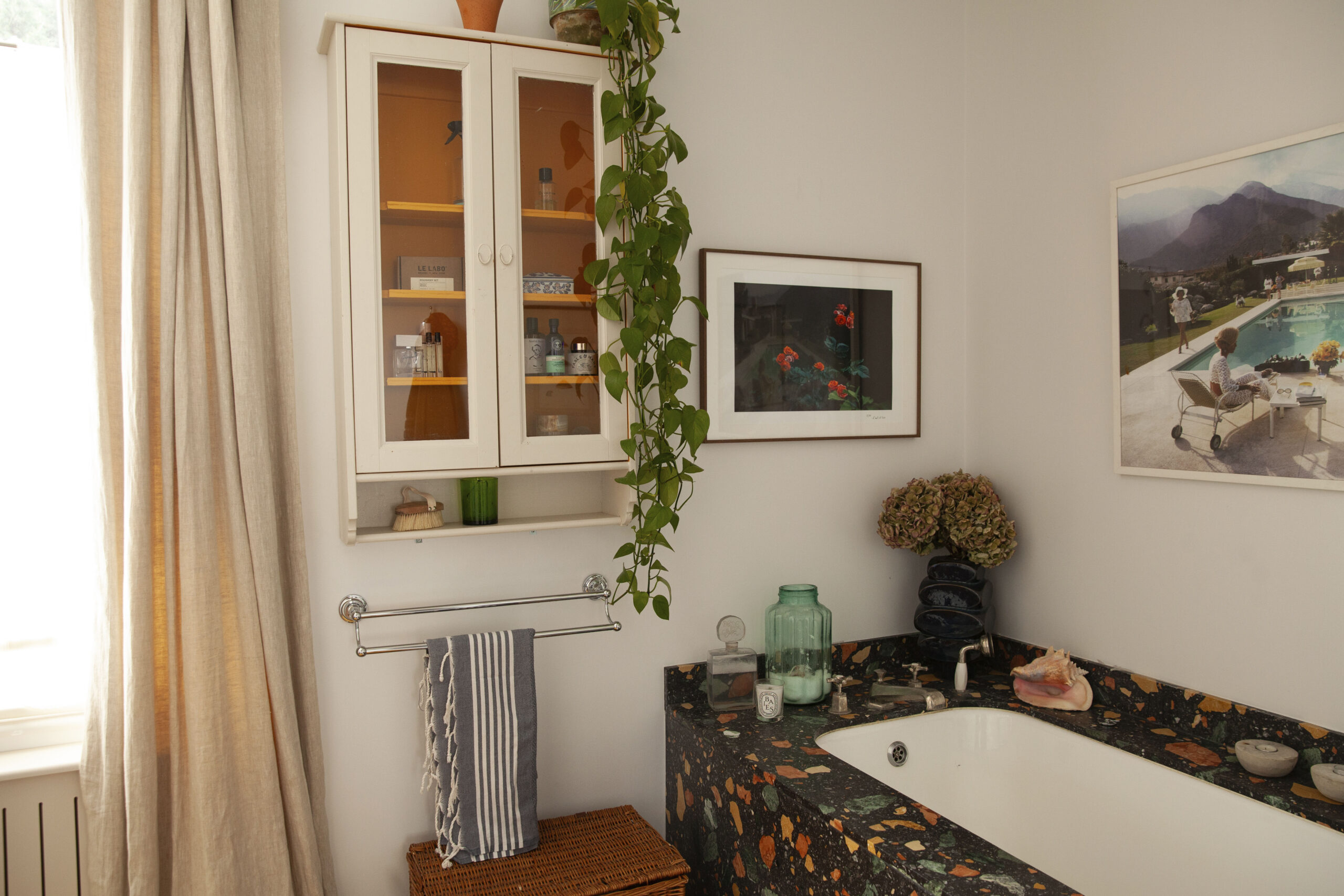
It also fits with Haskell-Thomas’s way of mixing styles and eras. The stainless steel contrasts with a marble table, traditional ceramics on the wall and a mix of fabric and bamboo blinds. ‘Layering up a house with different styles of furniture from various decades, contemporary with antique art and unexpected combinations of colour and print is what gives a rental house – or any house! – character,’ she says. She and her family have lived here since last summer and more space, as well as features such as built-in dressing rooms and a big terrazzo-framed bath, made the house a must-rent. It was, though, painted a cool grey. ‘But as the owners planned to paint it, we were able to choose the colours – Farrow & Ball School House White in the kitchen and hall and Pointing in the snug,’ says Haskell-Thomas. ‘Painting is the most transformative thing you can do to a space. Curtains and blinds are another worthwhile investment,’ she continues, ‘you can take them with you and have them re-sized if necessary, but it’s an instant injection of print/colour or personality that is entirely yours. The Colefax and Fowler curtains made for a previous house were a big investment but are now hanging in the drawing room here.’
She also focuses on small details that elevate a space, such as changing cabinet handles and curtain poles and installing café curtains with removable tension rods to hide unattractive windows or white goods. ‘I also buy forever pieces that can be used differently another time,’ she says. ‘A sideboard from Maud Vaughan Interiors works well for our hallway, but I imagine it one day in a coloured lacquer and in one of our children’s bedrooms.’
Tales Of The Unexpected
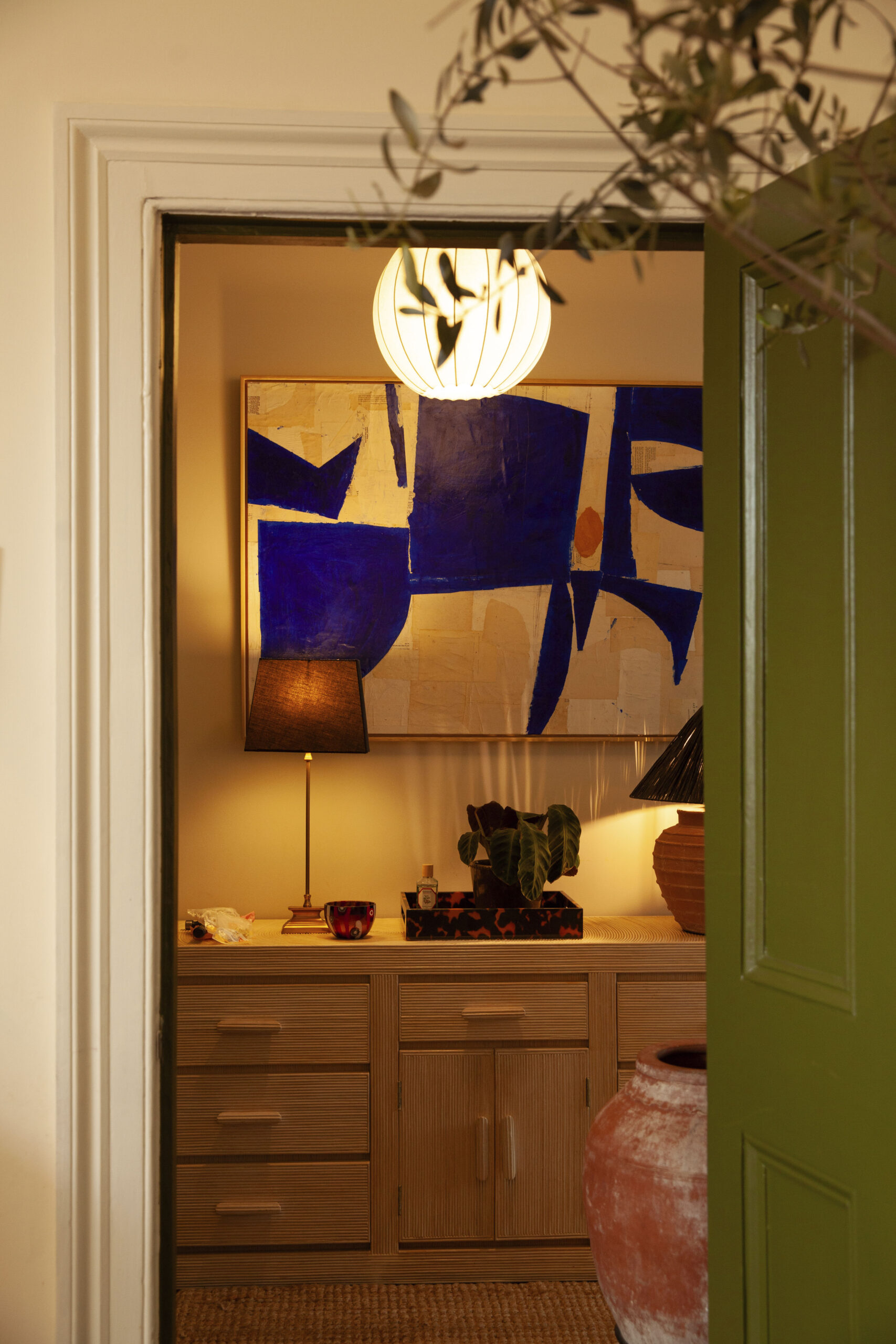
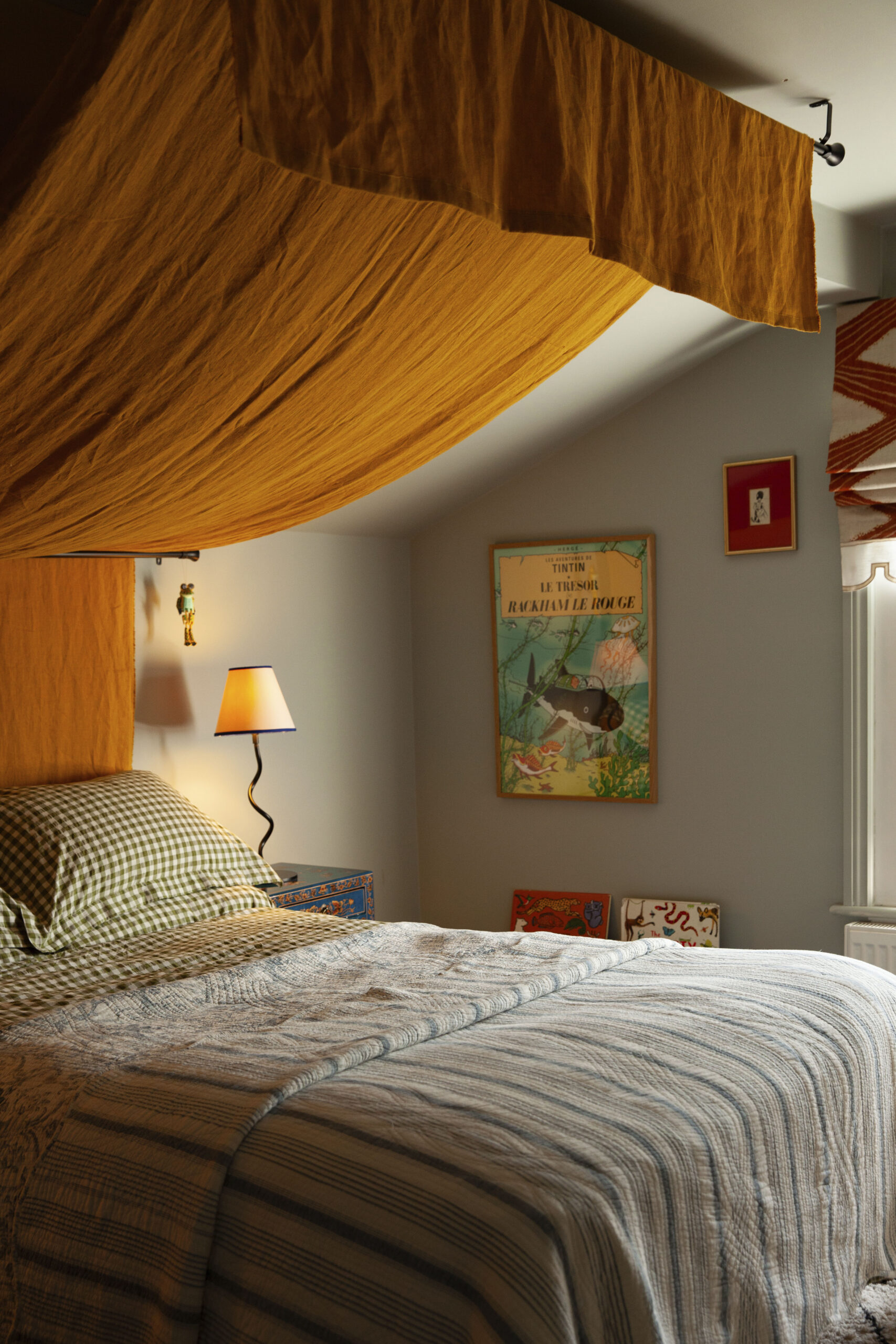
From a terrazzo-framed bath to a chequerboard coffee table and bed canopy, each room has a standout feature
‘Unexpected combinations give a rental character’
PATTERN POWER
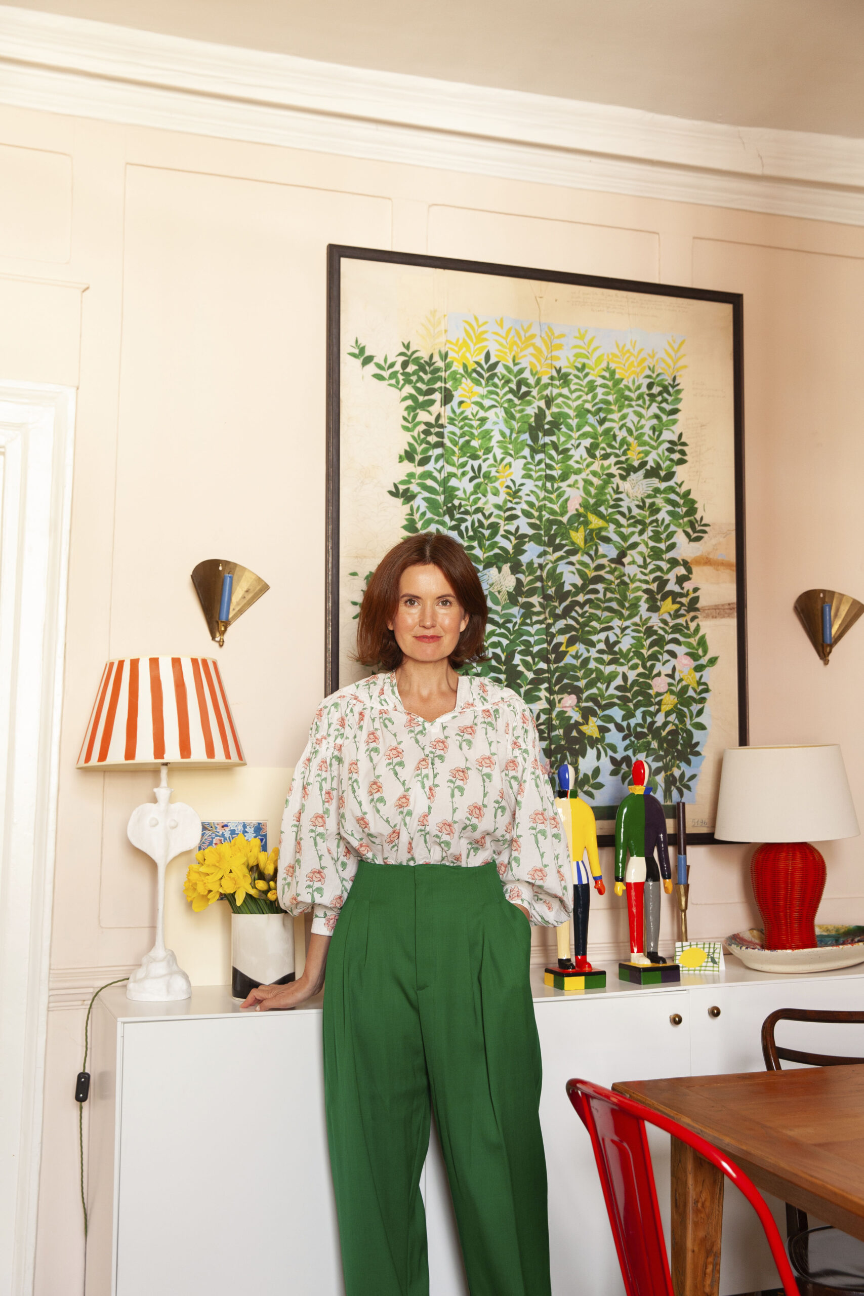
Gabby Deeming lives in a one-bedroom, second-floor apartment in a converted Georgian building. ‘It has beautiful period features, such as high ceilings, huge sash windows and period details, but it has been clumsily carved up, so it has a few awkward spaces,’ says the founder of fashion brand Daydress.
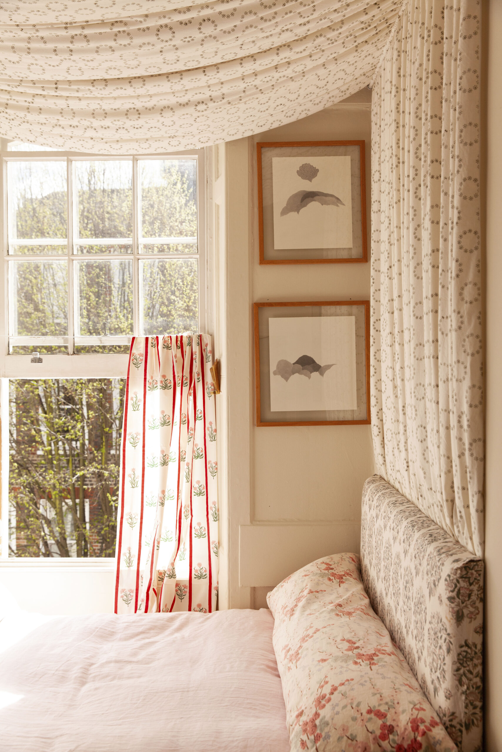
One of these is the bedroom, which is just a sliver of what was once a larger front room. ‘The only way to fit a bed in it and have any space left was to go across the room, rather than lengthways,’ she says. ‘I used nine metres of fabric to make the canopy and it makes the bed really cosy and a joy to be in.’
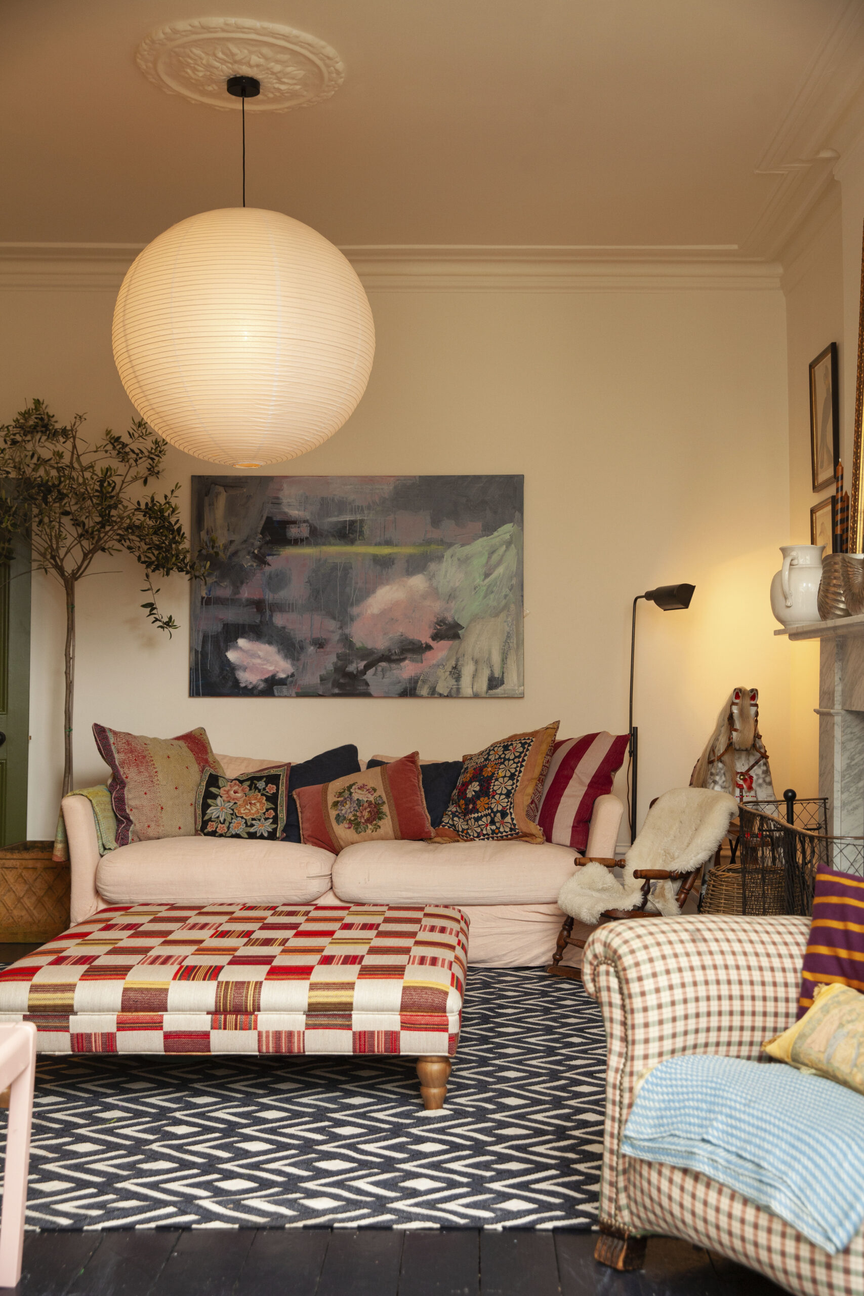
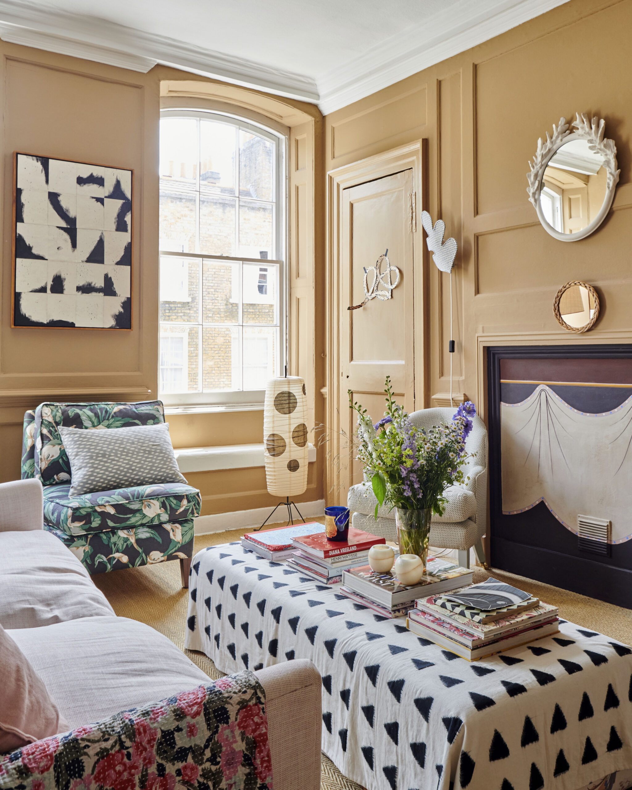
Deeming’s clever way with fabrics can be seen throughout the apartment. ‘I love colour and pattern and the apartment is filled with both,’ she says. ‘I have mixed new prints with faded pieces I have had for years and antique pieces that make a room feel grounded and not floaty and new. Fabric is a great way of covering things up – the wall above the sofa was a blank expanse so I covered it a vintage kantha quilt, which had been living on the back of the sofa.’
‘The apartment is filled with colour and pattern’
She has lived here for 10 years and hasn’t been afraid to change the apartment to suit her. ‘I think you have to be prepared to spend money you won’t get back – it’s about choosing quality of life over your purse,’ says Deeming, whose ‘How to Style with Pattern and Colour’ course is on Create Academy. ‘Not that you have to spend a fortune. Much of what I have done has been on a budget. I covered the hallway walls in Japanese washi paper, which comes in sheets rather than rolls so is much more economical.’
She also painted the walls and replaced the flooring, swapping beige carpet for seagrass matting and lino for wooden floorboards and cork. The kitchen’s existing faux maplewood cabinets blocked the light from the window, so she removed the upper cabinets and replaced them with shelves. The new base units and sink are from Ikea, teamed with an oak worktop. Since launching Daydress, Deeming spends six months in Britain and six months in Jaipur, where her pieces are made. ‘I’m renting in India and decorating there too!’
Conceal & Reveal
In the bedroom (above), gabby deeming created an elegant canopy to disguise a small, awkward space. Colour and pattern define the living room (below)
WORDS RACHEL LOOS PHOTOGRAPHS TRENT McMINN

