What’s new now!
Your guide to all things interiors starts here. Don’t decorate without it
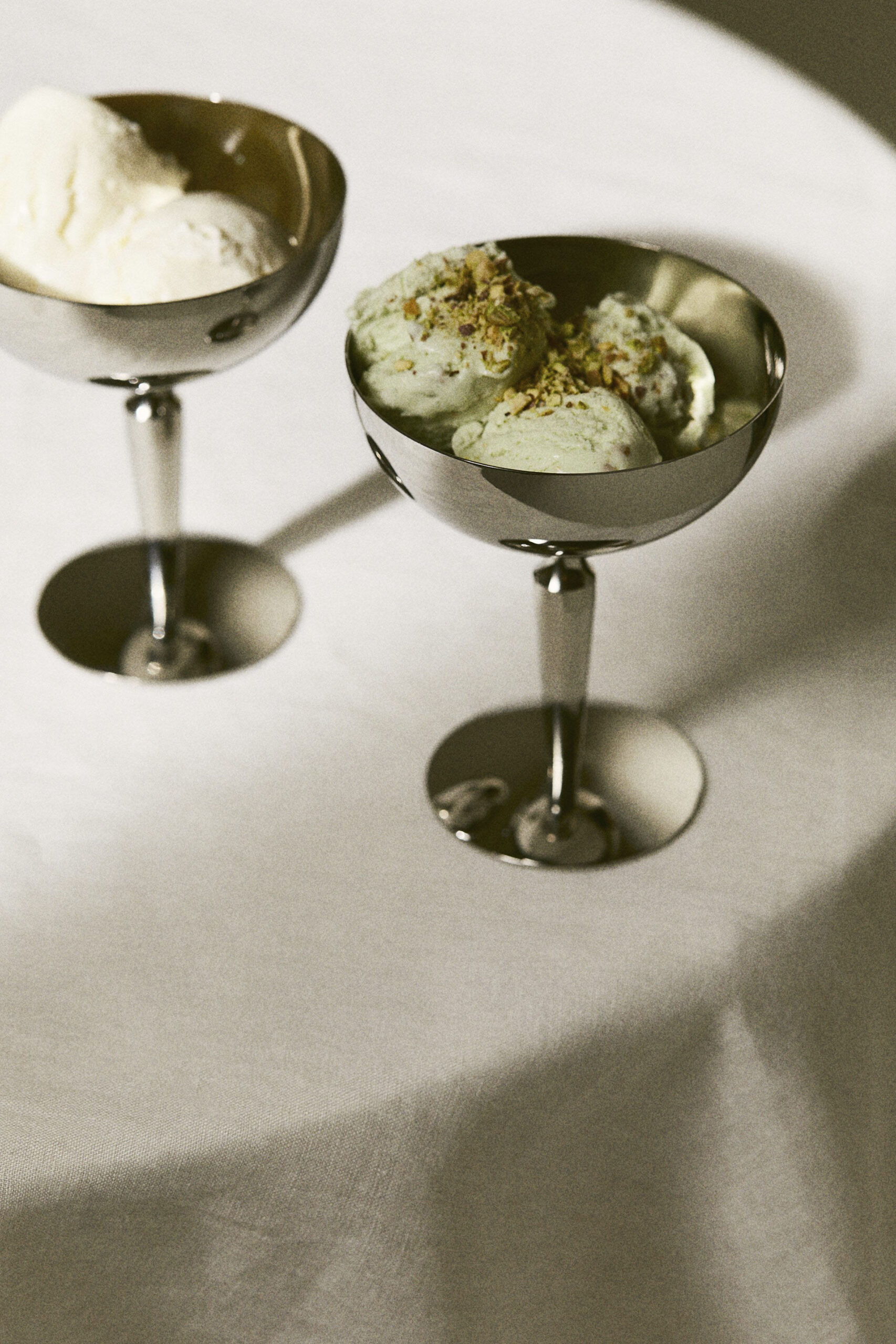
Ice-cream bowls, £9.99, H&M Home
1. Blue Steel
It began in the kitchen with sleek, industrial spaces that allowed us to imagine starring in an episode of The Bear, but the versatility and durability of stainless steel has seen it segue into the rest of our homes. It’s a pared-back, modern complement to vintage and a perfectly tuned note to a more minimal decor. Highly reflective, it subtly accentuates the light, particularly with sculptural candlesticks, table lamps and mirrors. On the table, opt for stainless steel cutlery or a serving platter; retro ice-cream bowls are a shine-tastic end to a meal.
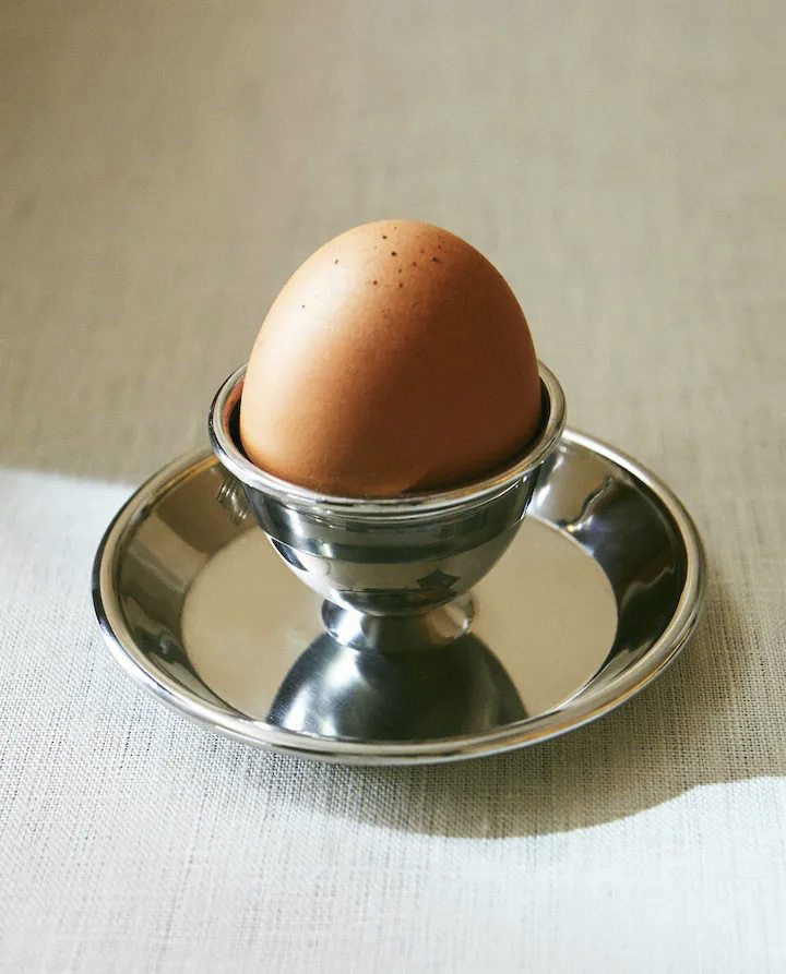
Egg cup, £7.99, Zara
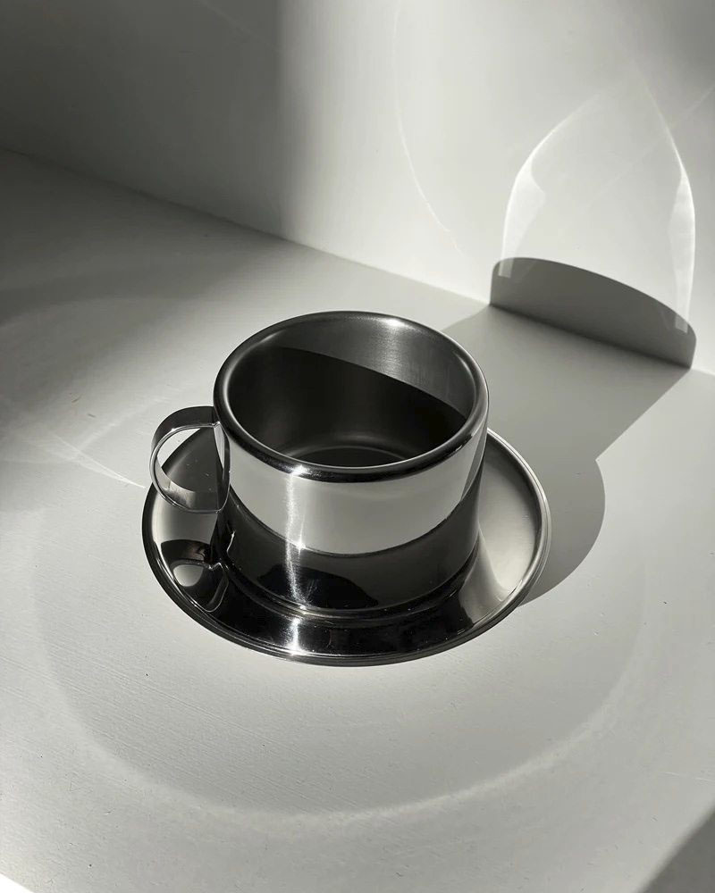
Cup and saucer, £50, Bettina Ceramica
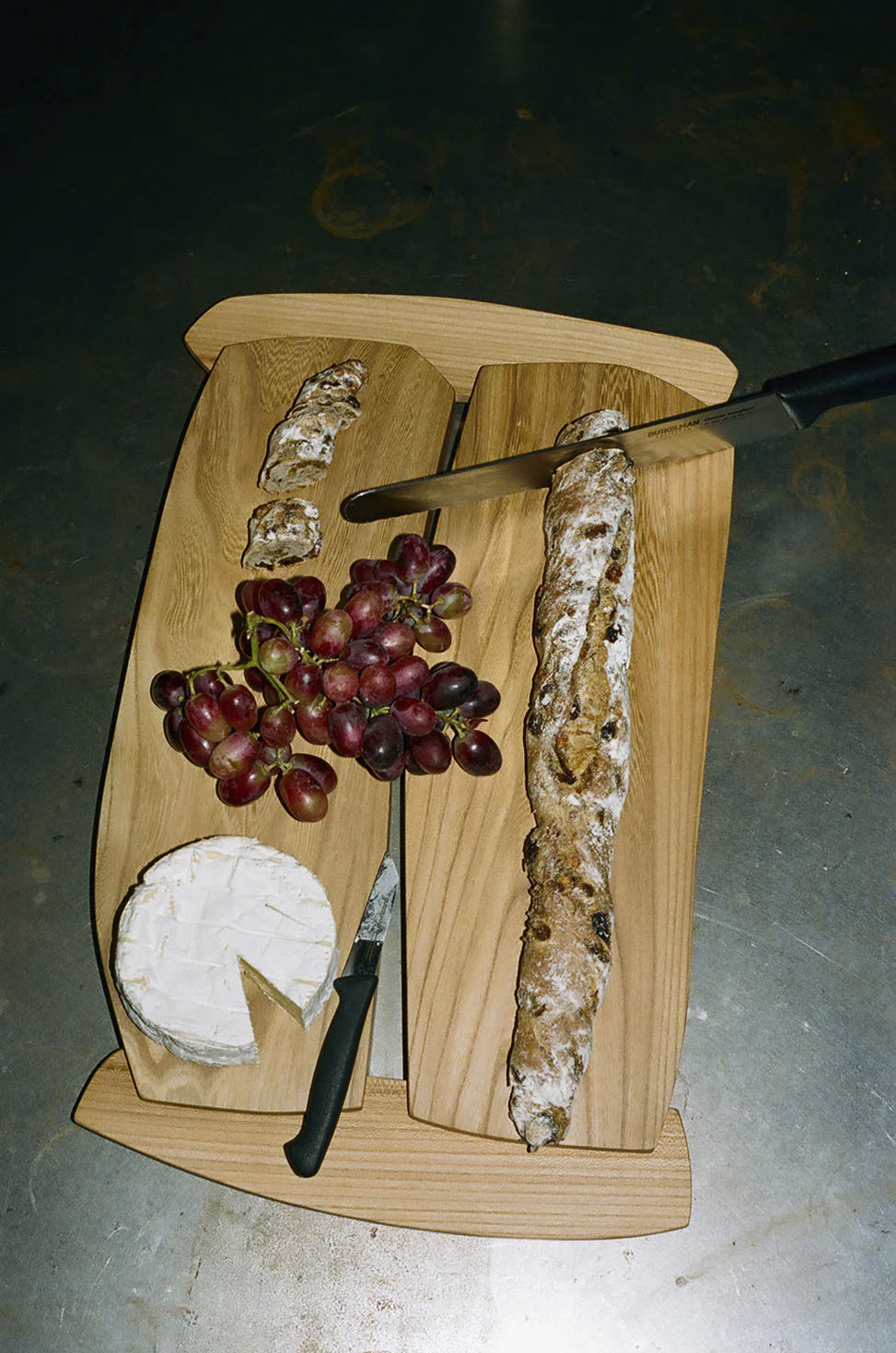
Double Loaf Board, £425, RiRa Objects
2. Dinner Service
There’s hardly a more sobering reminder of your single status than preparing dinner for one. Deciding on a meal, doing the shop, thinking about portion sizes (and what you want to eat for the next three days if you get those wrong), have put most singletons off cooking.
Enter TikTok and its magical solution algorithm for virtually any hurdle life throws at you. Presenting simple but chic recipes – think toast, ricotta and a dollop of blackberry or a tomato, anchovy and olive tart (where store-bought pastry is fine, FYI) – our endless scrolling has finally come to benefit our lifestyle. Plus, it’s never been easier to make it look pretty. Foodstallation for one? Yes please.
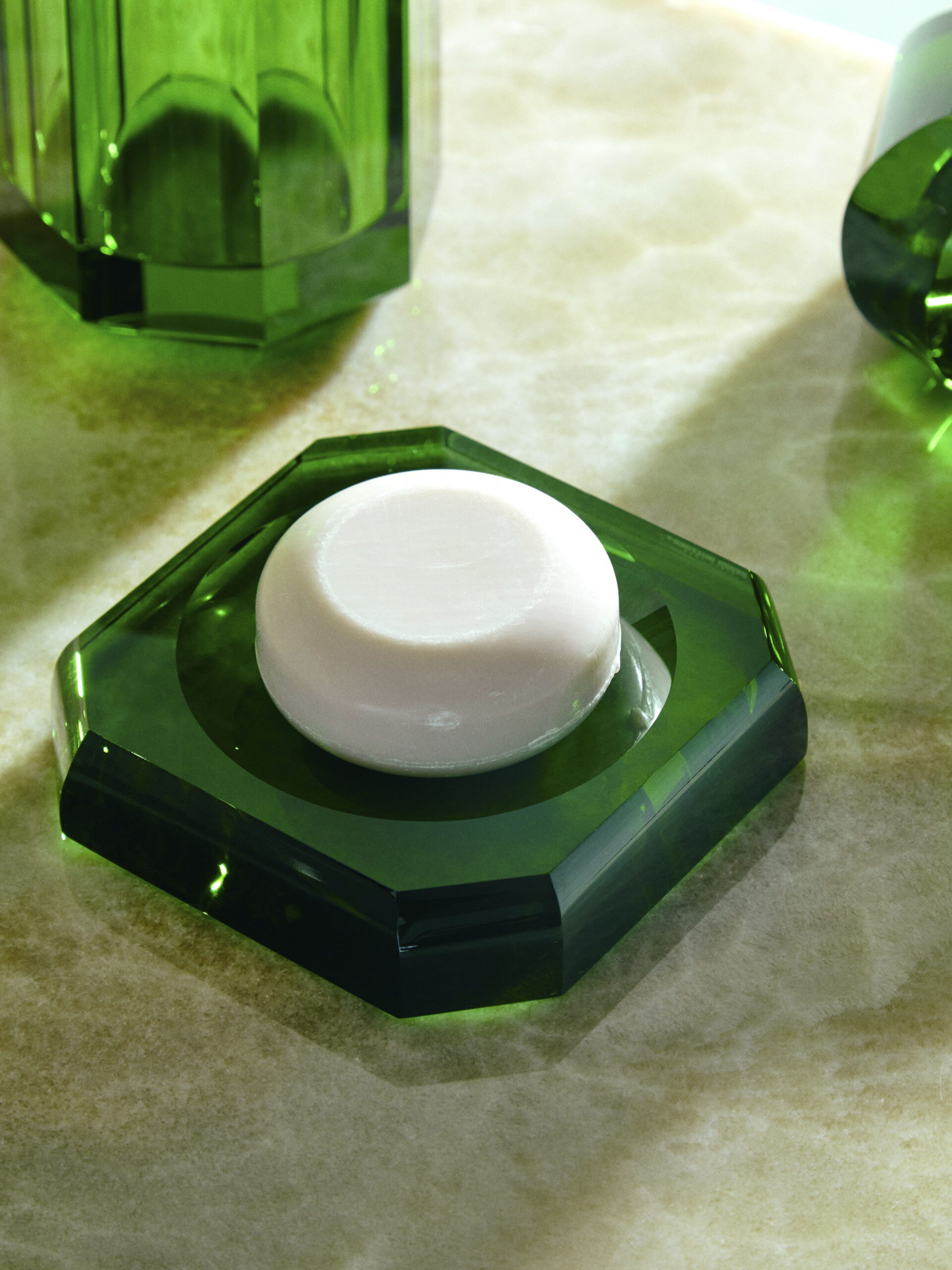
Soap dish, £120, Abask
3. Pimp your bathroom
Forget boring! Bathroom accessories have been given a design makeover, so now you can curate this room as carefully as the rest of your space. From soap dishes in jewel colours to deliciously scented lotions and potions and pretty grooming pieces, washing has never been so stylish
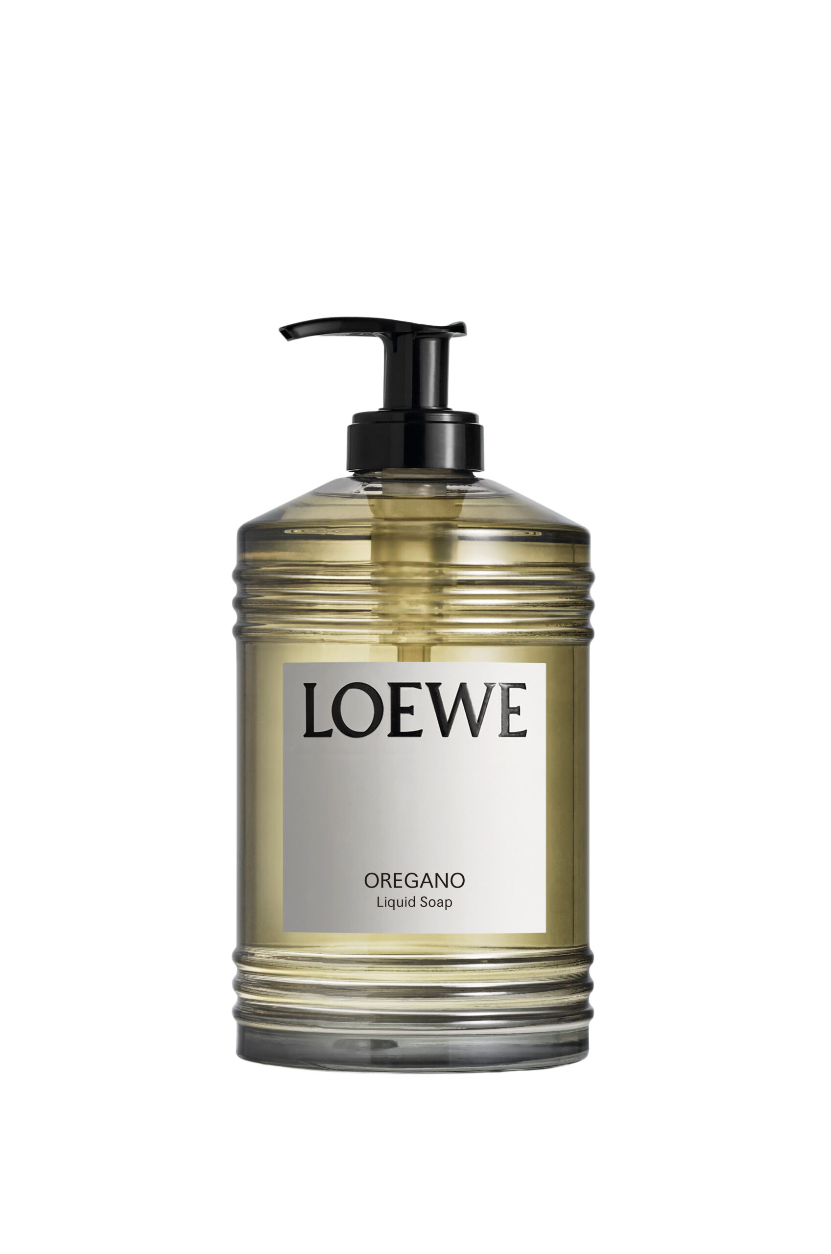
Oregano liquid soap, £57, Loewe
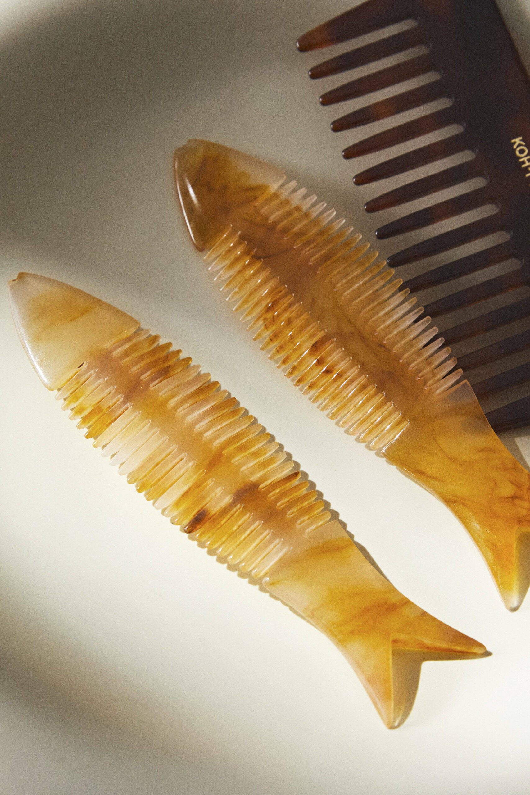
Comb, £12.99, Zara Home
Devol Kitchens
4. Seeing red
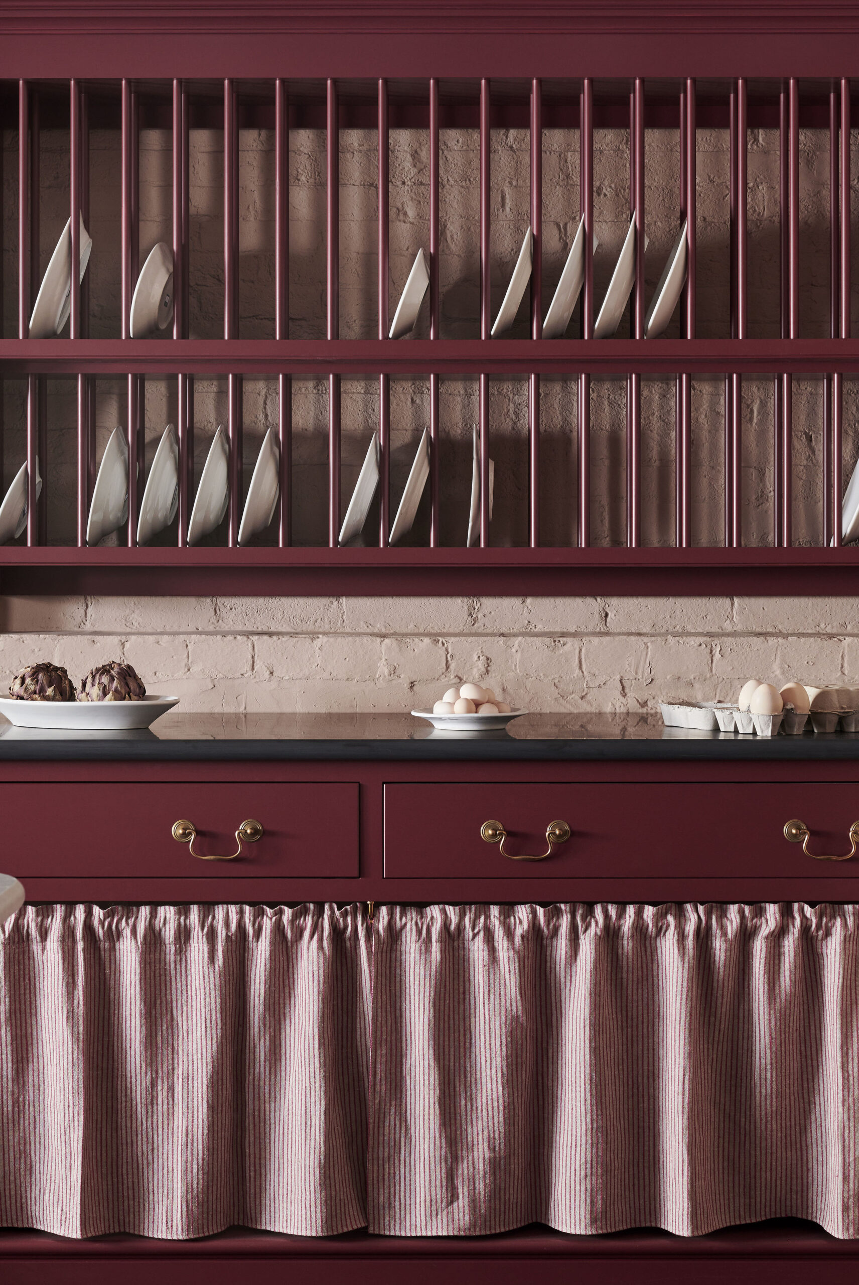
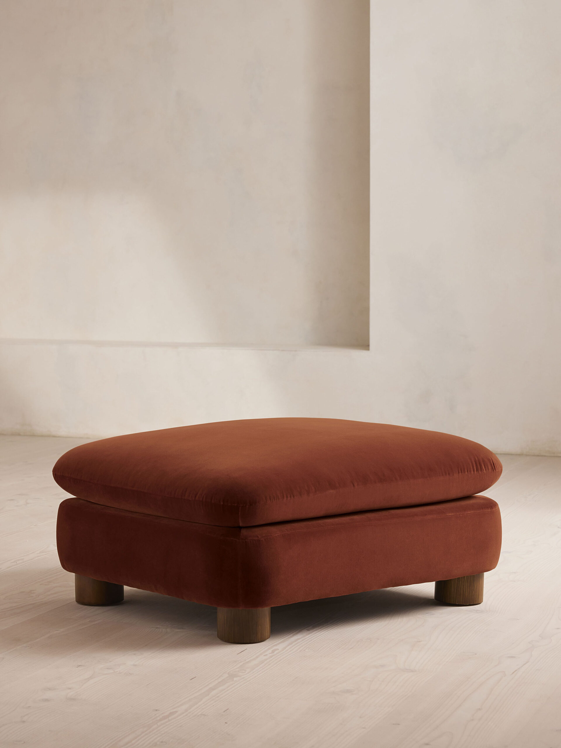
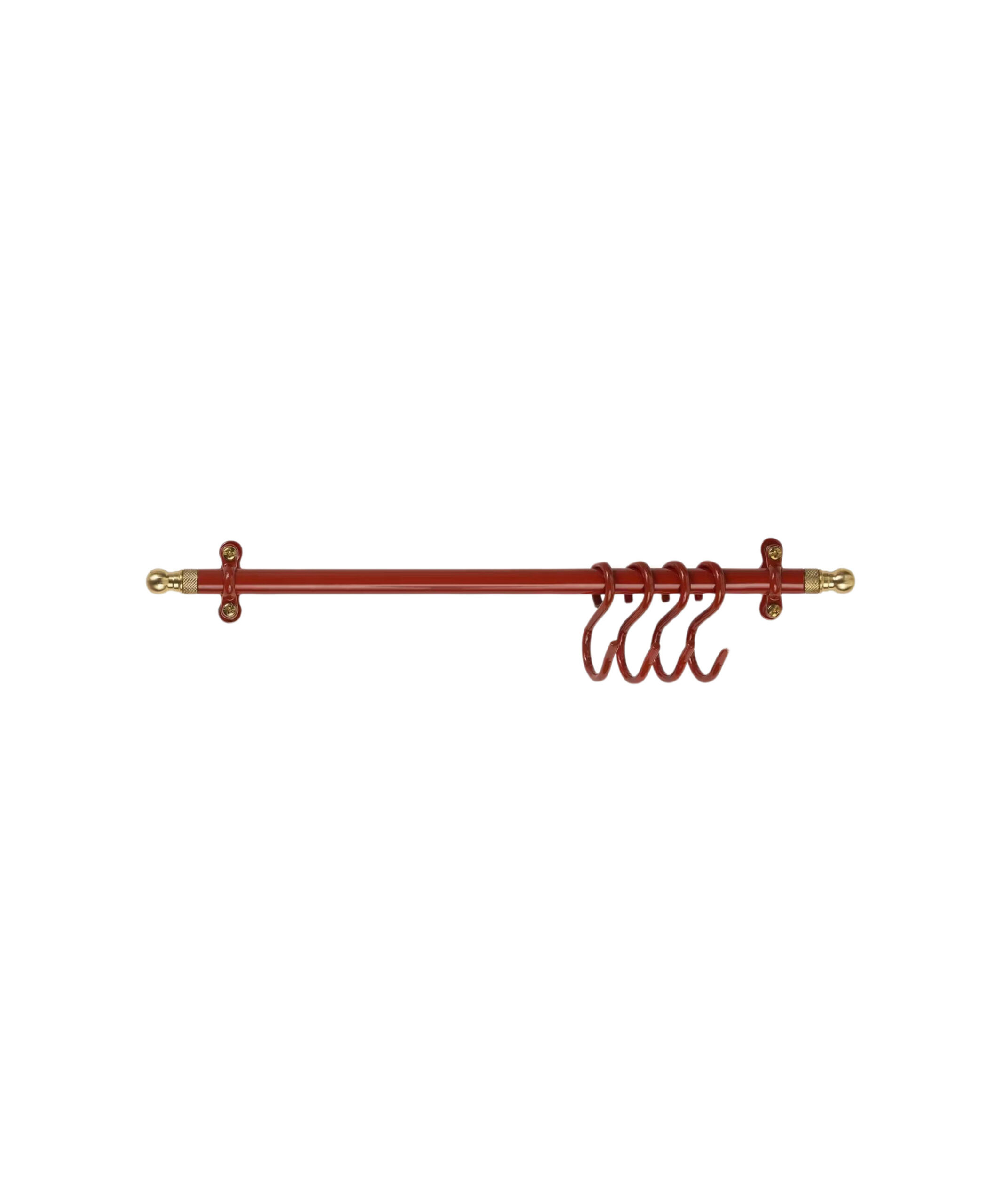
Thankfully, not all TikTok design trends make it beyond the social mediasphere, but the Unexpected Red Theory is one we like. Coined by Brooklyn-based interior designer Taylor Migliazzo Simon, it’s about giving a room an unexpected flourish by adding red as an accent. It can be any tone, from a super-bright scarlet to a more muted burgundy – think a standout kitchen shelving unit, a living room light or a glossy red mirror in the bathroom.
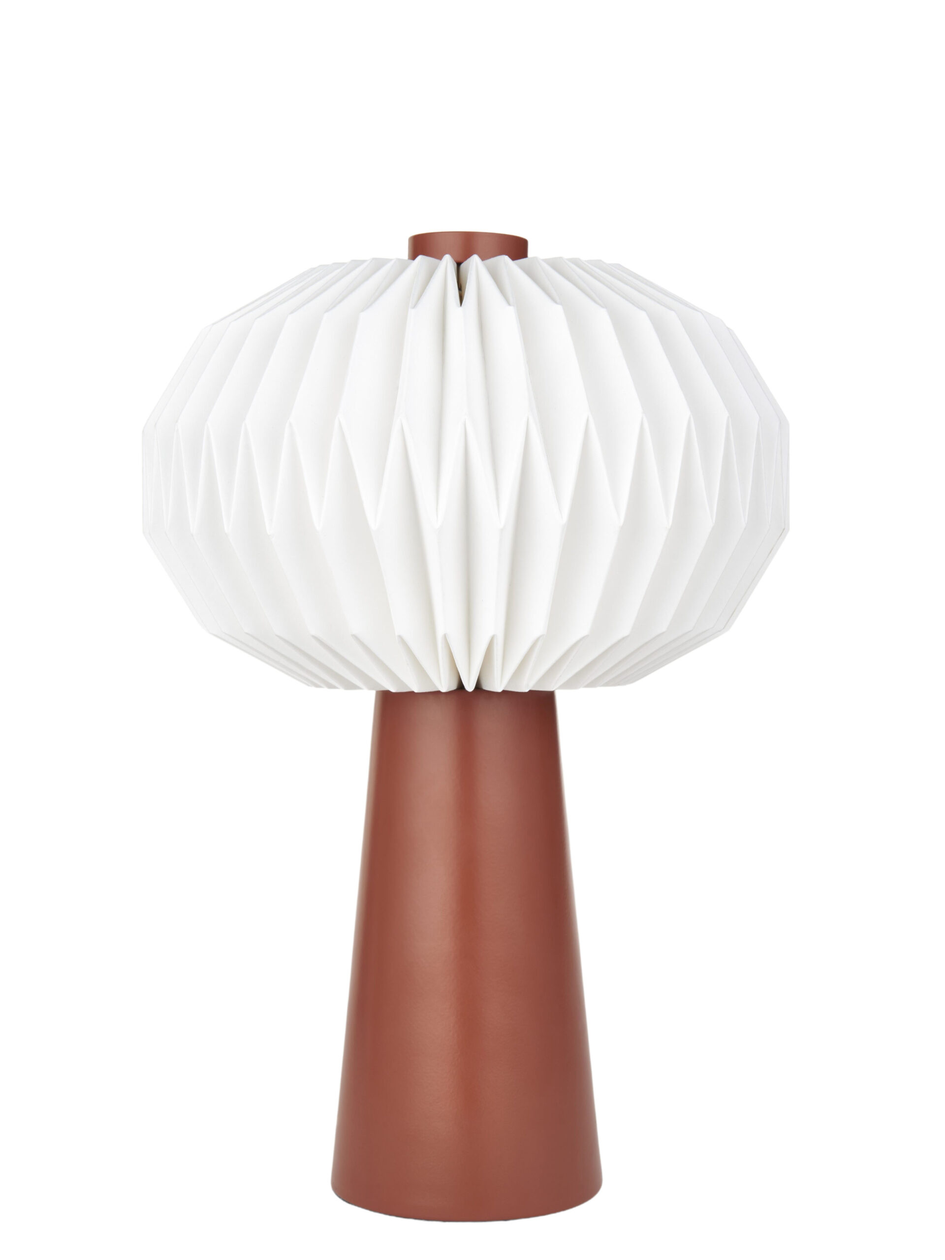
Table lamp, £35, John Lewis & Partners
Ottoman, £995, Soho Home
Rail, £95, Gloag & Daughters at Glassette
5. Book Club
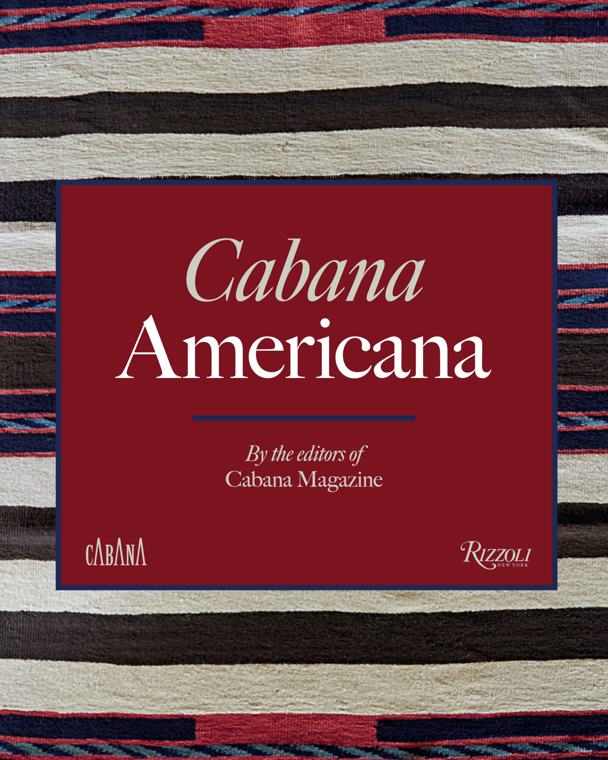
Yes, they look chic on the coffee table, but we also love a design book for inspiration. Right now, we’re poring over A New Glamour, the debut from super-hot interior designer Bryan O’Sullivan showcasing his mid-century-meets-modern style; Cabana Americana, a homage to amazing US architecture and interiors, published to celebrate the magazine’s tenth decade; and Studio Ashby: Home Art Soul, featuring stunning interiors from Sophie Ashby’s eponymous studio. Happy reading.

Soho Home
6. Bouji Backyards
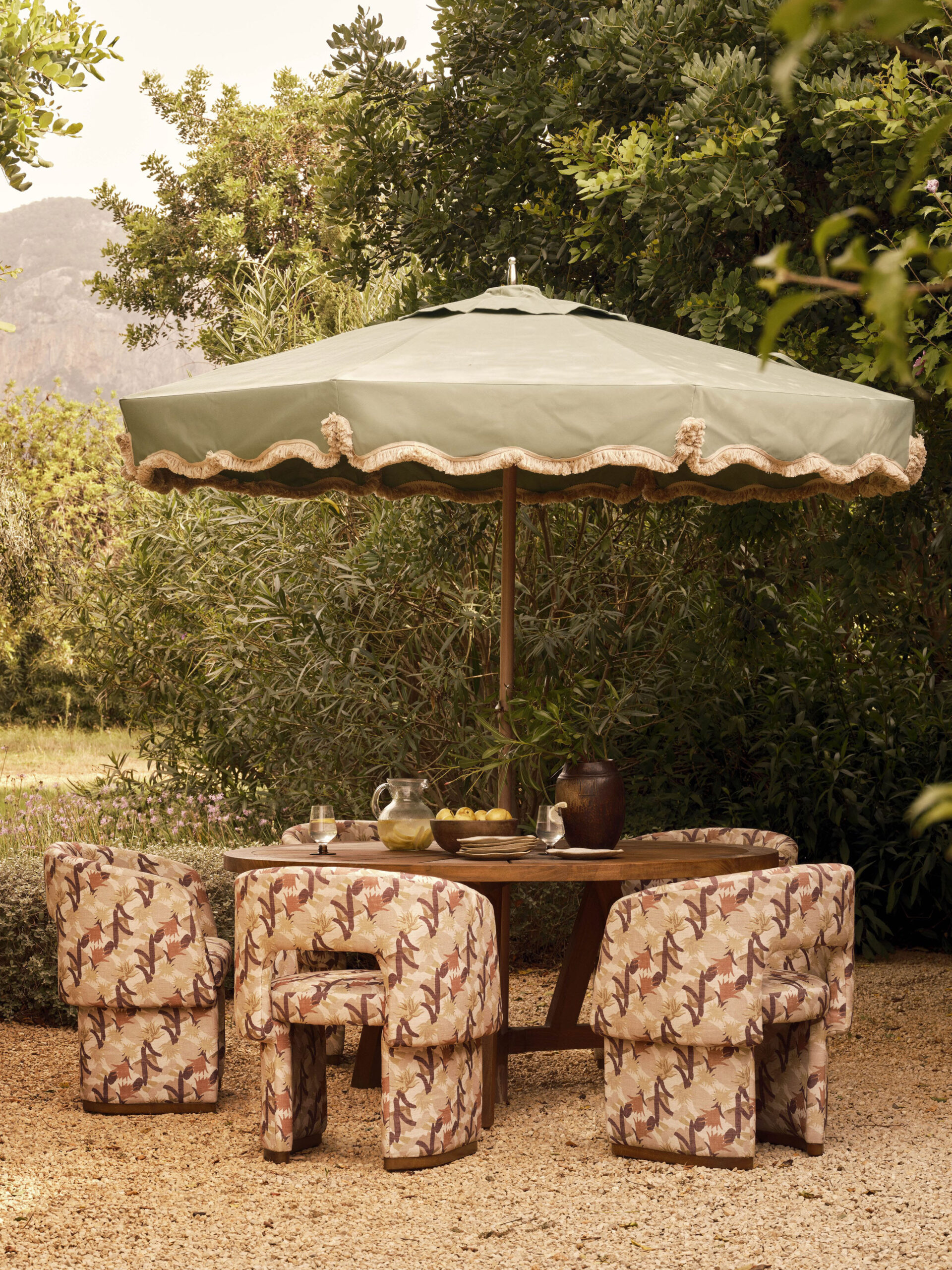
Whether on an expansive lawn or balcony, ’tis the season for alfresco entertaining (if the Great British summer plays ball). From printed parasols – try Daals and East London Parasol Company – to the new outdoor collection from Soho Home, your outside space can be a chic extension of your home, no Monty Don required. ‘Transforming a petite outdoor space into a stunning retreat is all about clever styling and thoughtful touches,’ says Lily Mullen, product creative at Rowen & Wren. ‘Embrace the intimacy of the area by selecting versatile furniture that serves multiple functions, such as foldable chairs or bijou dining sets. Pretty accents, like
a vintage parasol, delicate textiles or decorative pots, can also infuse a space with personality and charm.’
7. would you DIY your tablecloth?
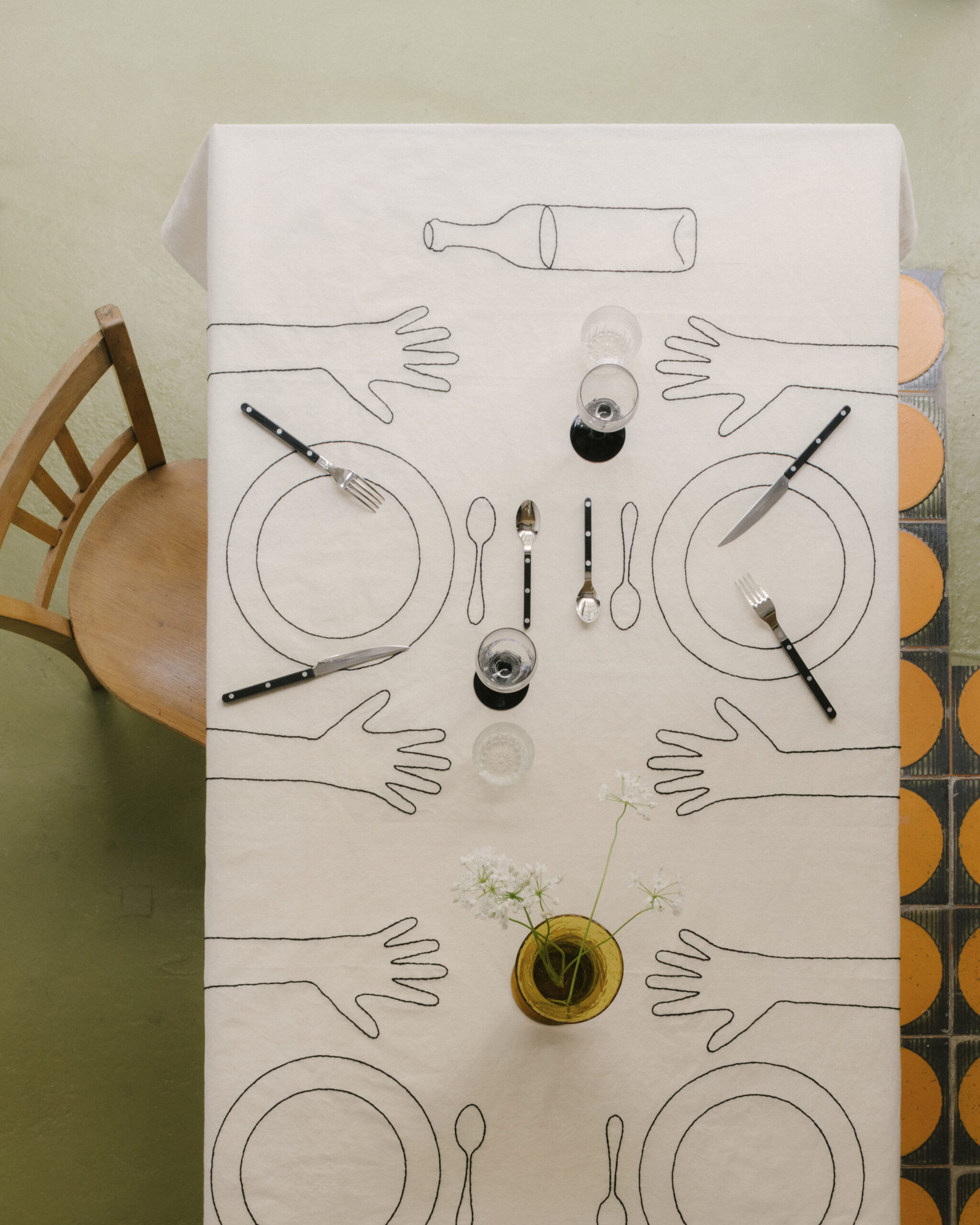
Tablecloths have had a dressing down of late, with the chicest of hosts opting for vintage linens or even a paper cloth for their latest spreads. Affordable, disposable (if not the most sustainable) and entirely hassle-free – if you’re the sort of entertainer who breaks into a sweat at the sight of a red wine ring, this is the hosting hack you’ve been waiting for. Those with a family might also enjoy its dual use as a scribble pad. Pop the kids at one end with a pot of crayons and leave them to do their worst. For something low-fi but luxe, bookmark Oeuvres Sensibles’ custom tablecloths. Handmade in Marseille using sourced linen and cottons, the unique pieces will deliver a tablescape with a talking point.
Alice Palmer
8. Try a drape scape
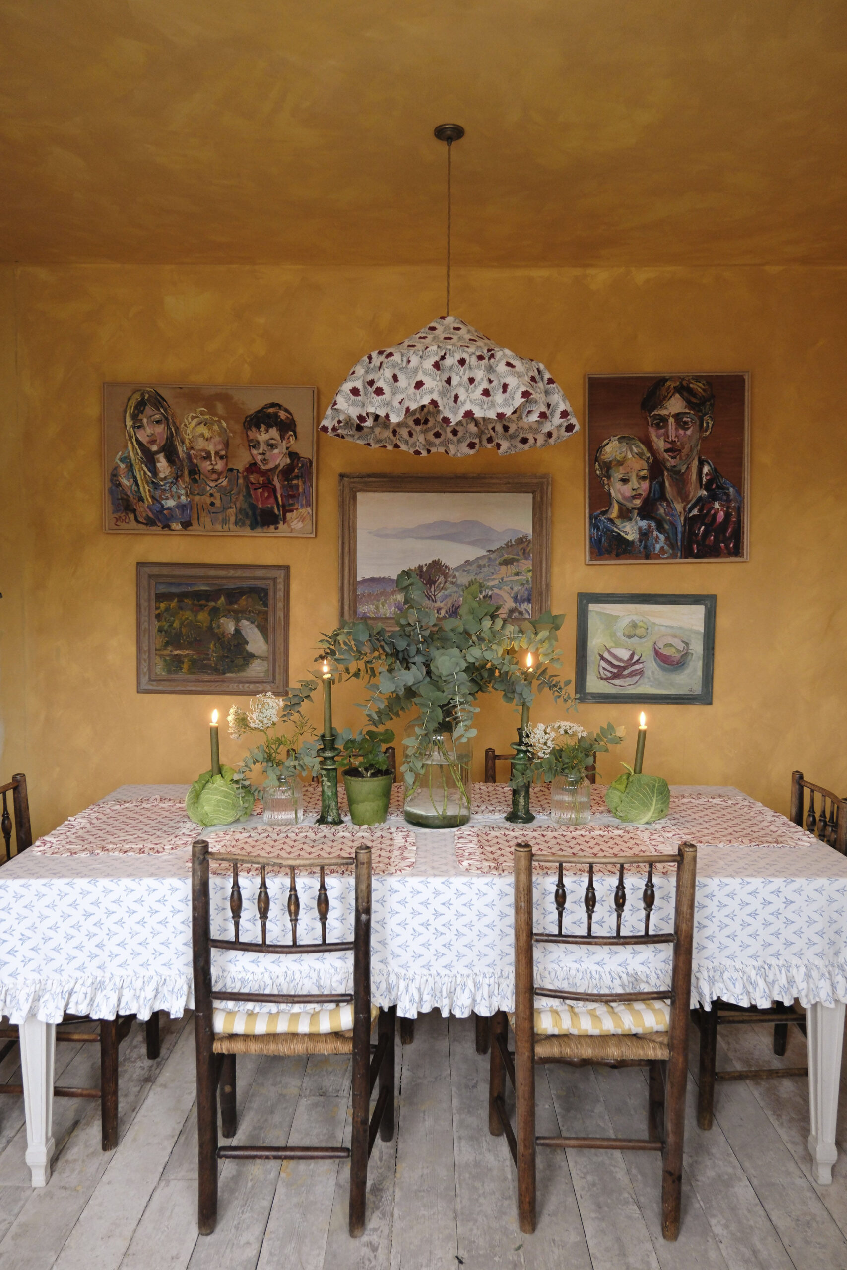
From Beauvamp’s ruffle lampshade to Alice Palmer’s pantry lampshade, draped shades are in. Beata Heuman’s Paper Bag versions, made of sheer linen, mellow a room’s atmosphere and are inspired by the fabric shades used to soften early electric bulbs. ‘Since we launched our pantry lampshades, they’ve been very popular,’ says Alice Palmer. ‘They also work beautifully in bedrooms, hallways and other spaces in which you want to create a softer light and add texture.’
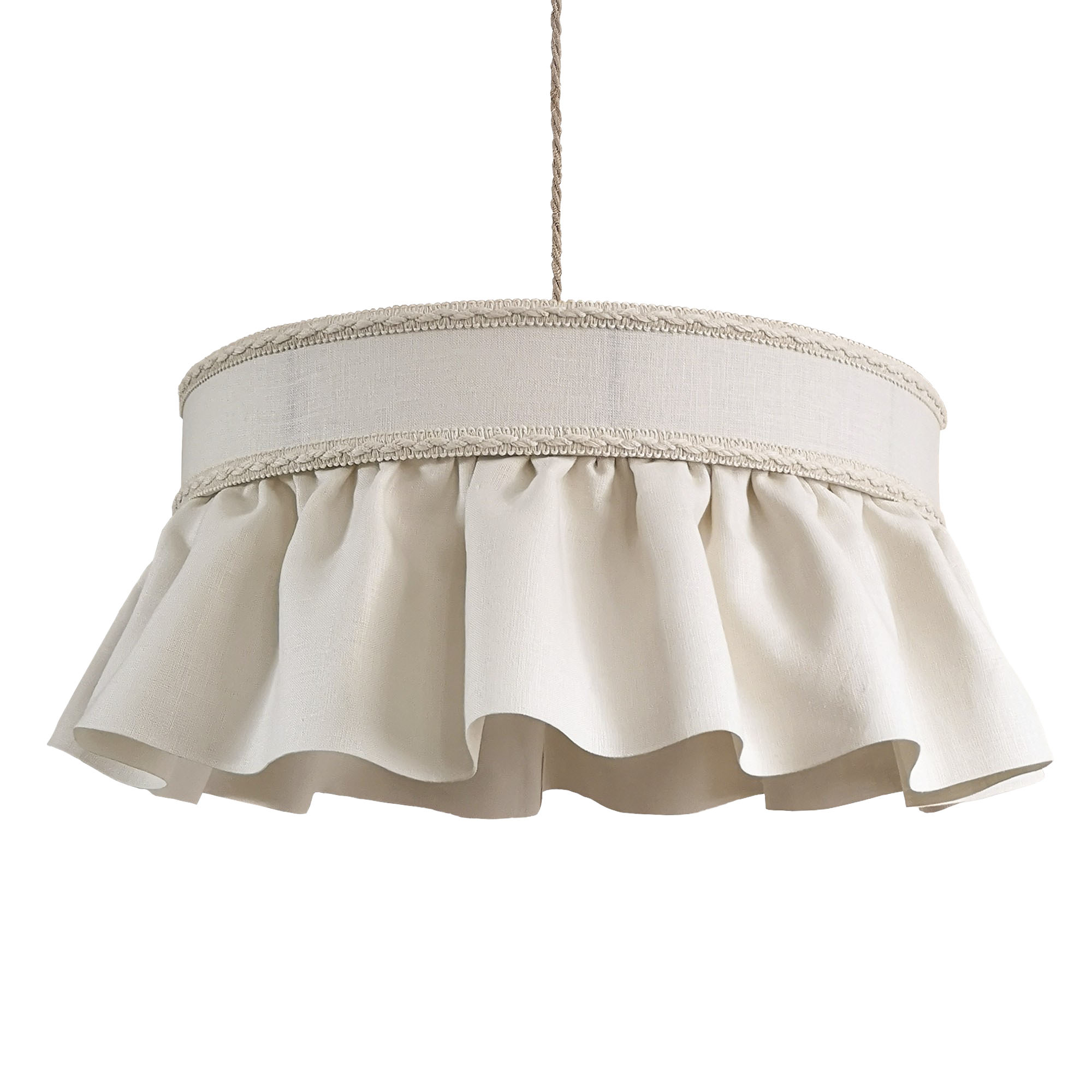
Ruffle lampshade, £545, beauvamp.com
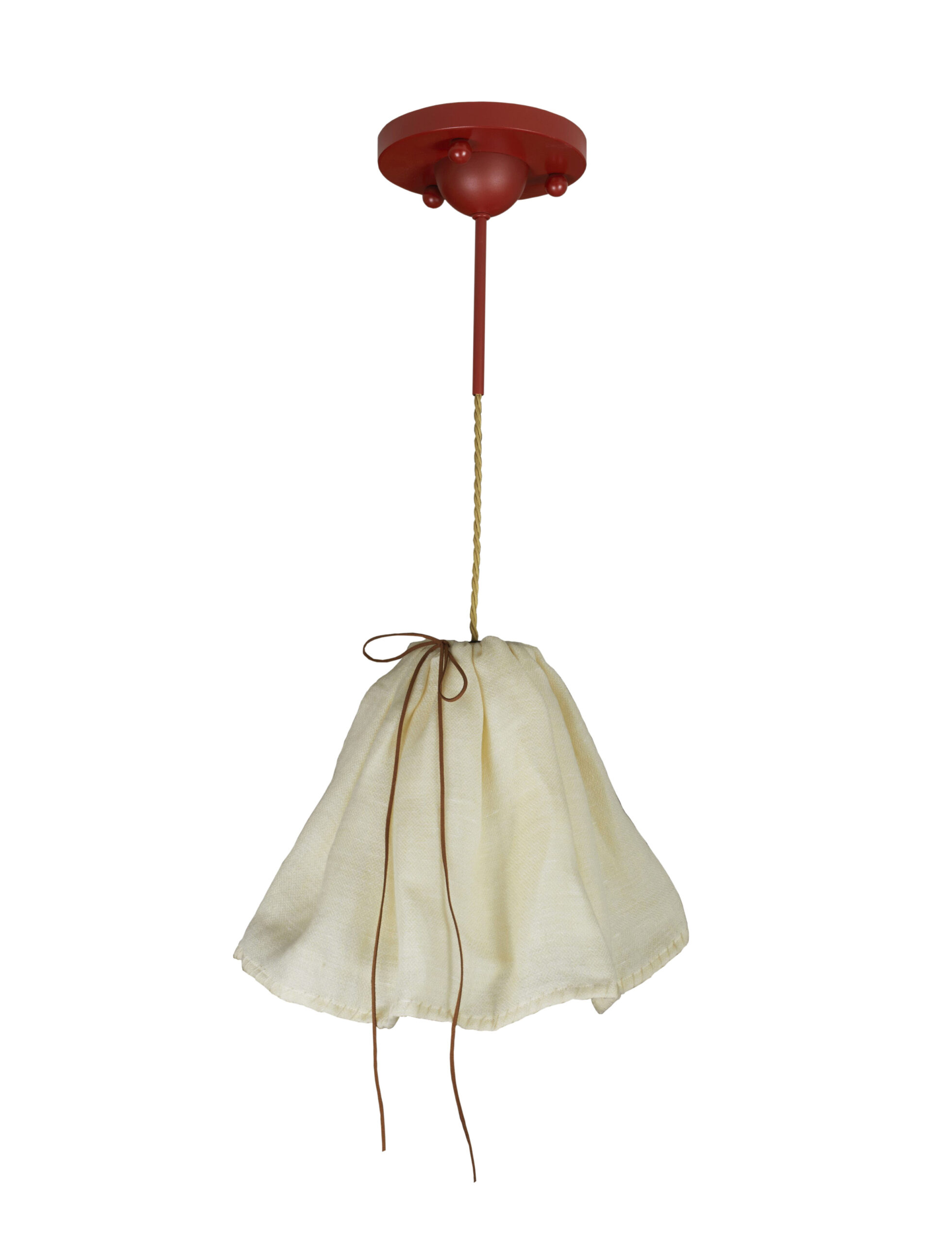
Paper bag pendant, £960, beataheuman.com
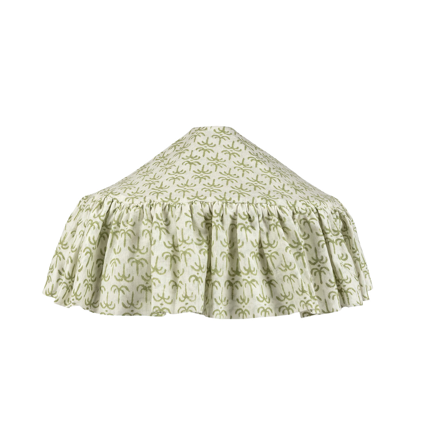
Pantry lampshade, £285, alicepalmer.co
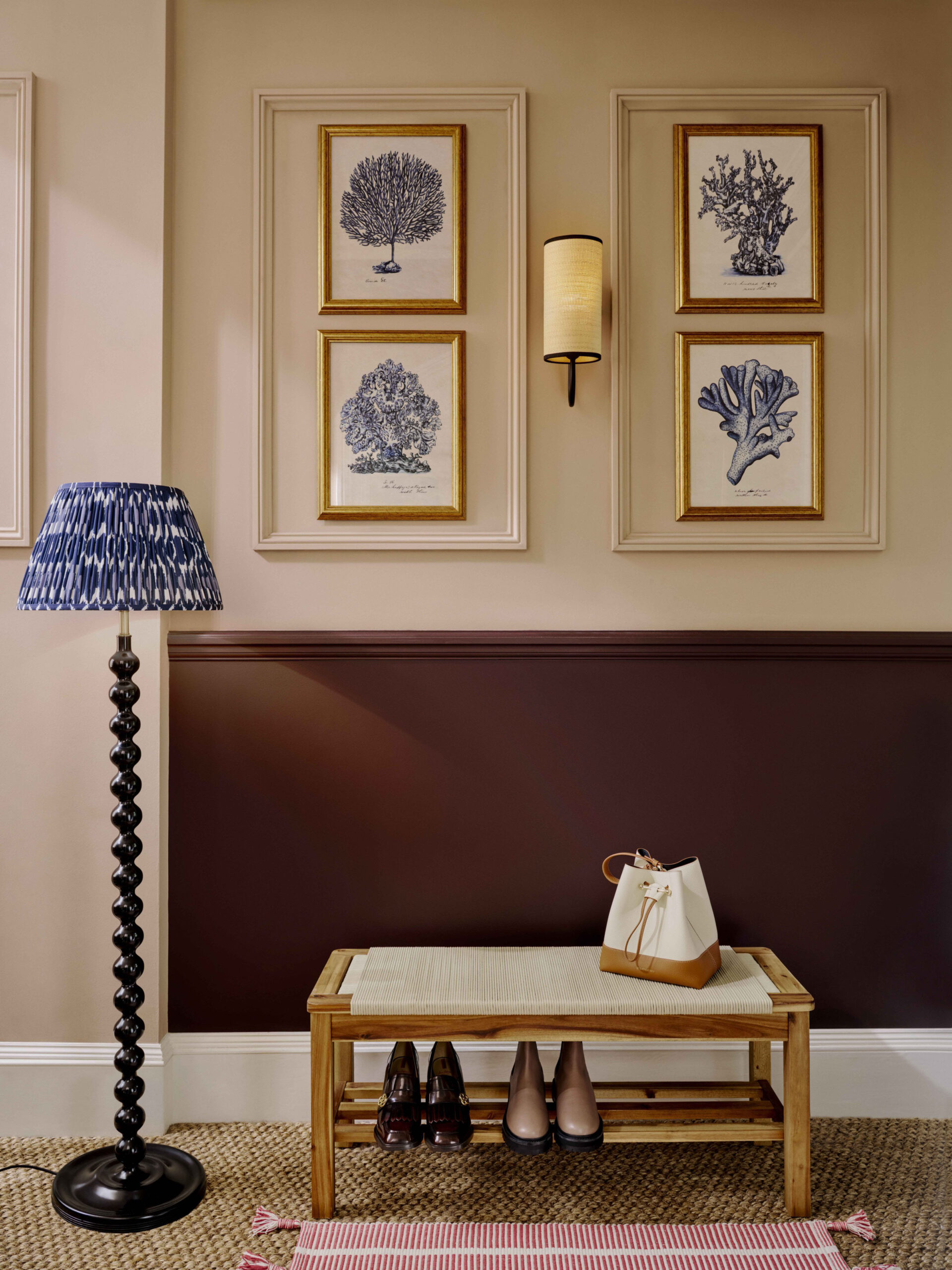
John Lewis & Partners
9. The Big switch
No matter how stylish, dimmed or smartly placed your ceiling light is, it will never hold a candle to your beloved table or floor lamp. Why? It casts unflattering shadows, creates a harsh atmosphere, is often too bright and is devoid of any cosy-factor. TikTok has gone as far as separating people into big light versus small light factions, declaring that neither should mix. We find it difficult to disagree. Let’s leave the overhead fluorescent shine to our offices and focus on modifying our home into a decompression zone to shake off
the harsh reality of the outside world. Buy uncomfortable dining room chairs, ignore all feng shui rules but, whatever you do, turn off the big overhead light.
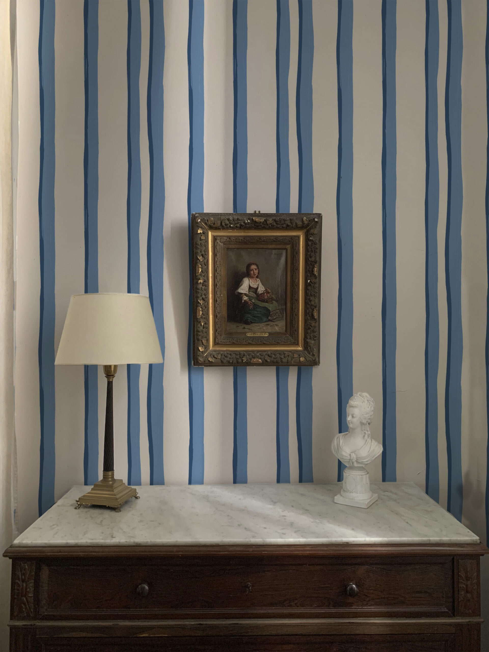
Somerset Stripes wallpaper, £165/10m roll, Annika Reed
10. Personality Wallpaper
Wallpapers have got crafty. Annika Reed draws on paper before carving her own woodblock and hand-printing her design. The result is richly coloured and patterned papers that have a 3D, textured look. Then there’s House of Hackney’s Hollyhocks paper, which is a hit both on and off Instagram, the bold design looking as though it has been coloured in with crayons. Equally eye-catching is Custhom’s hand-painted and silkscreen-printed Tilde wallpaper. Inspired by weaving, the painterly pattern sweetly refers to the creative friendship behind the collaboration with 2LG Studio (find it at Glassette). Petra Palumbo’s charming new range is inspired by the archives of Tapisserie, the specialist needlework company founded by her mother. We particularly love wavy Longchamp. How to decorate? Not just a feature wall, but across the room. It’s the least these wallpapers deserve.
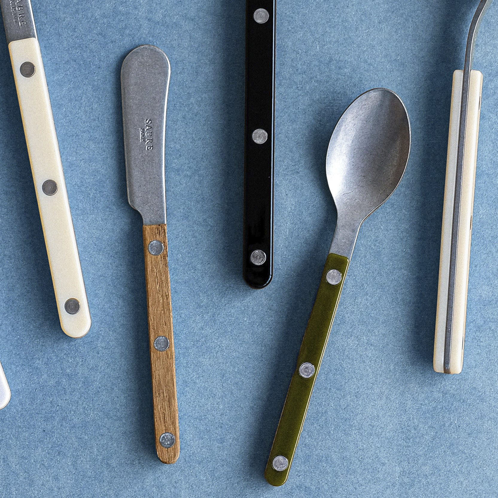
Teaspoon, £9.90, Cue Sabre
11. CUlt cutlery
From café curtains (bookmark East London Cloth company) to mismatched dining chairs, French café culture is still wooing the design world. We’ve already nabbed their striped ecru linen tablecloths (see eBay for vintage grain sacks), so it’s no surprise we’re now stealing their bistro cutlery too – fun, yet surprisingly functional. Cue Sabre, the Paris-based company specialising in coloured cutlery – it graces the most stylish tables.
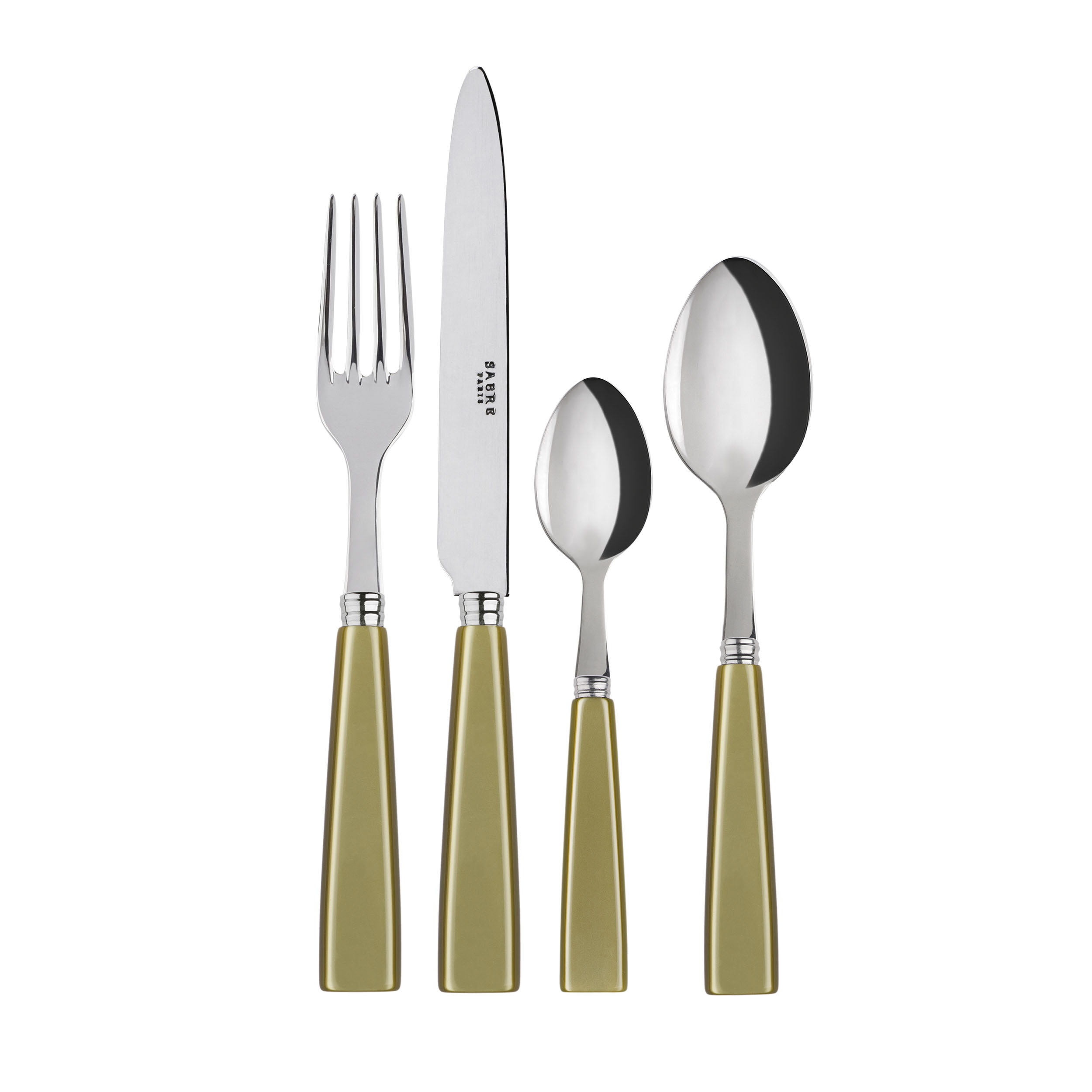
Cutlery set, £72.70, Cue Sabre
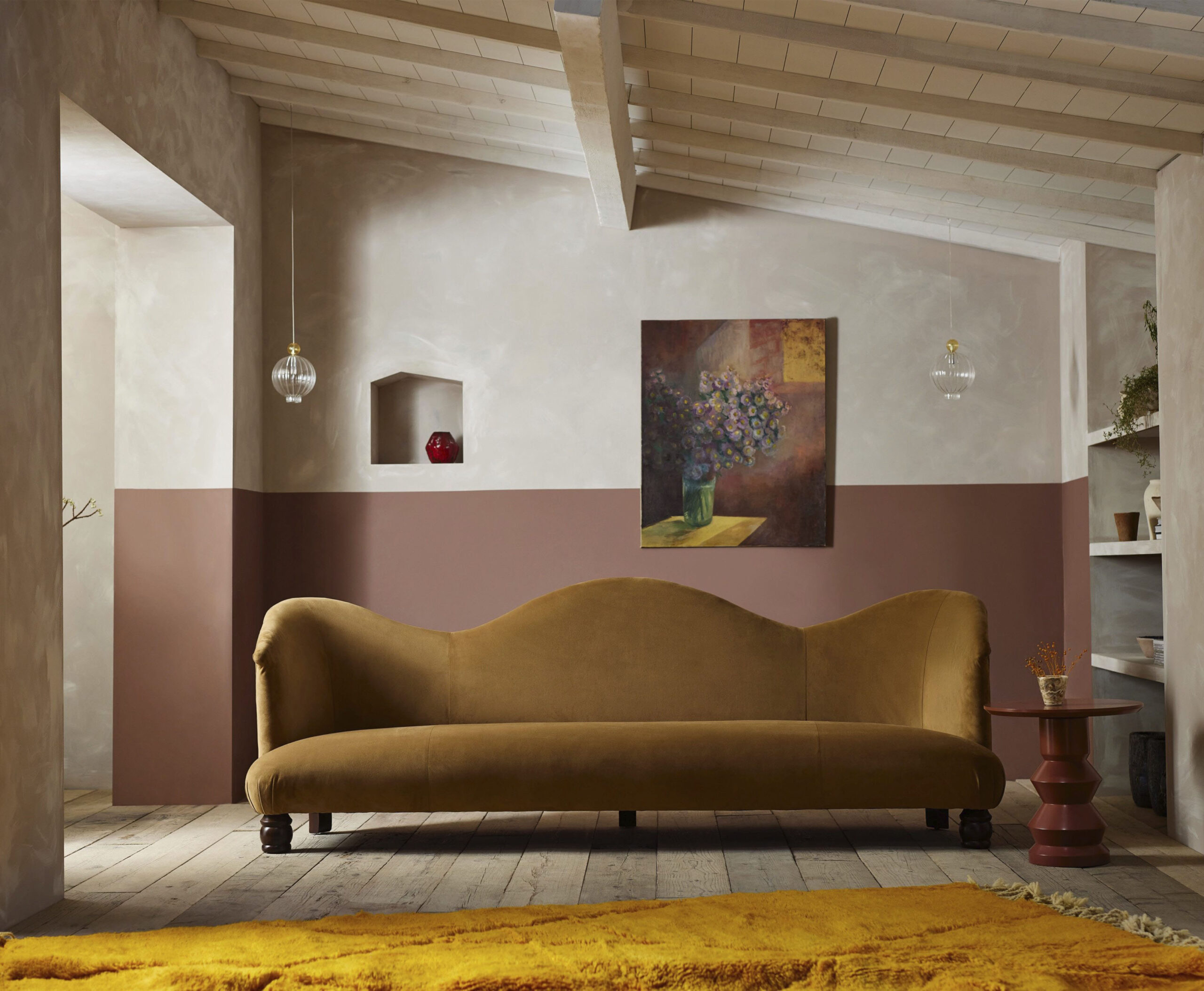
Form by Tallboy
12. Got Form
Have Malton, Yorkshire, on your radar: it’s home to antiques firm Tallboy Interiors, which has a new furniture line. With tradition at its core, the range – furniture, rugs, lighting and accessories – is handmade by master craftsmen. For another chic escape, head to Bath. Margaret’s Buildings houses independent shops, including Berdoulat (posh groceries, natural wines and interior trinkets) and stay at 8 Holland Street’s art-filled townhouse – the perfect sleepover for an aesthete.
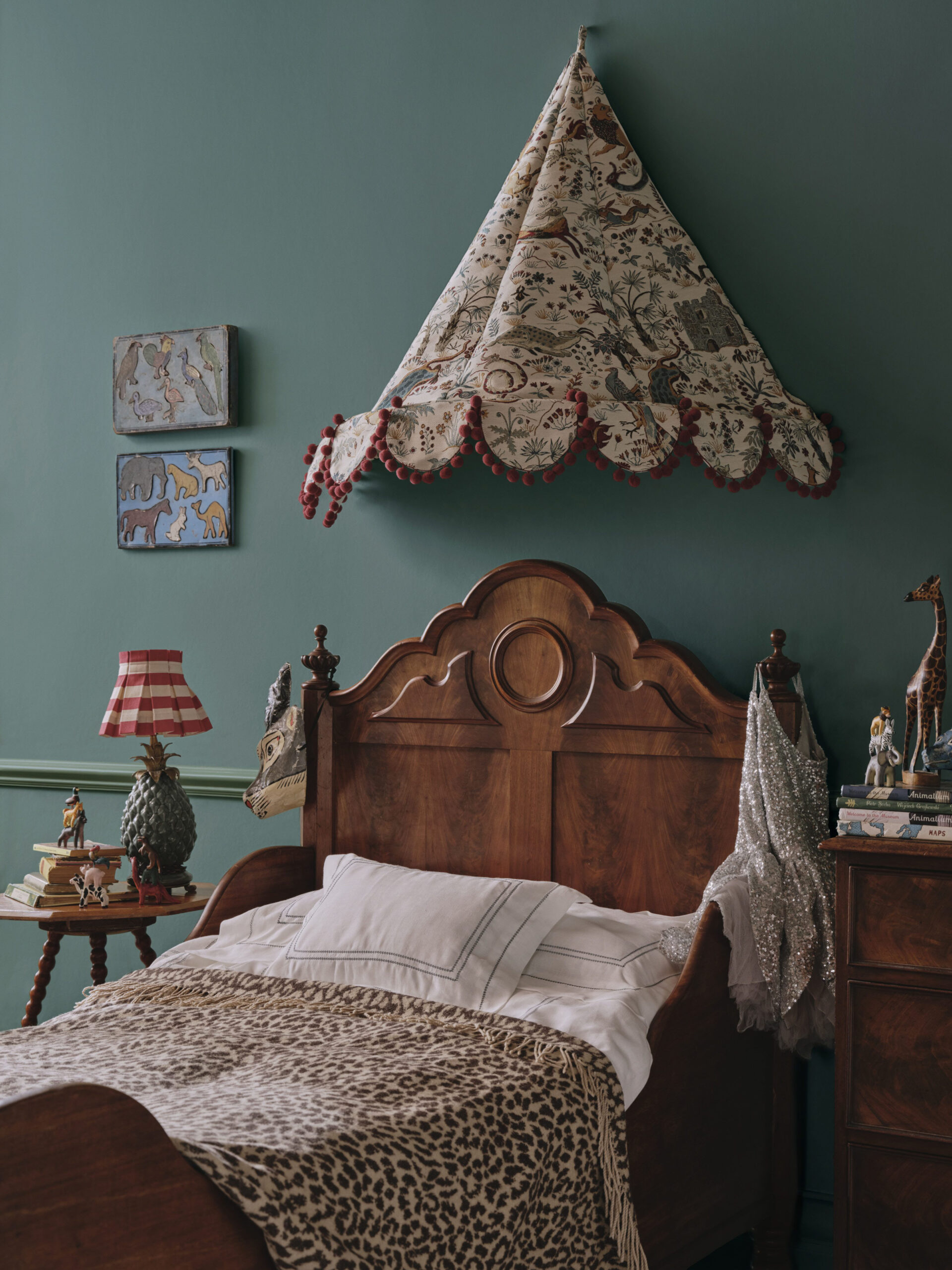
House Of Hackney
13. New Wave Nurseries
Bespoke wallpaper, luxury bed linens, hand-painted wooden toys – chic nurseries are ubiquitous on Pinterest, but is anyone attempting this at home? Well, yes. When kidswear label Mini Rodini launched homeware in 2013, the idea was to kit out a child’s bedroom in the same kooky prints as their wardrobes. Meanwhile, Theodora Chandris’s Maison T is a 400-thread count kids’ bedding brand, handmade in Florence. ‘Beautifully made bedding lasts and I found there was not much out there for children,’ says Chandris. Have aesthetes gone too far? No, says PR consultant Anika Birchall, it’s all about what you choose. Plastic toys are fine – provided you have some chic storage to tidy them all away in (she recommends Weston and Jamal boxes by Liewood.) A cute hack is a simple canopy. ‘It adds a decorative feature and be converted into a reading nook for the toddler years,’ she says.
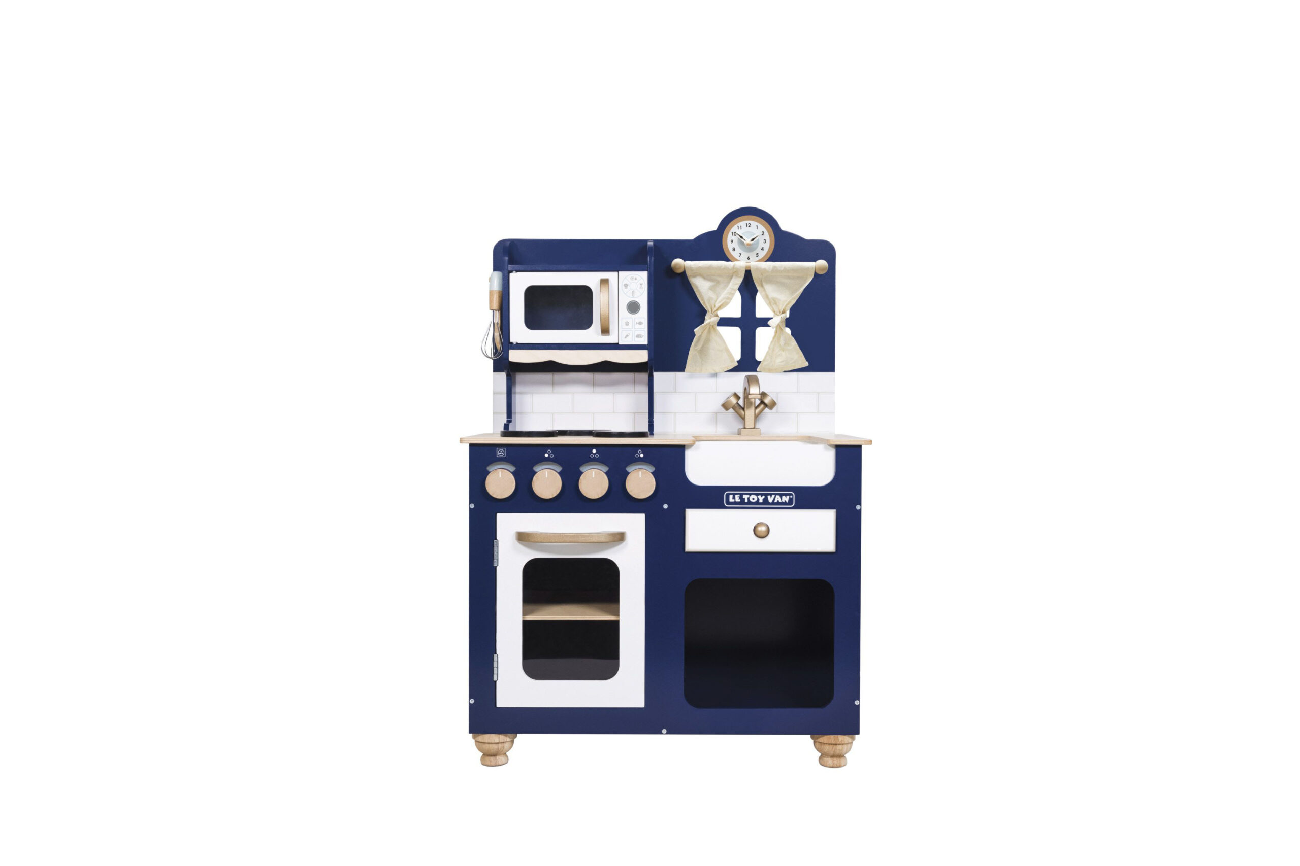
Kitchen, £219.95, Le Toy Van
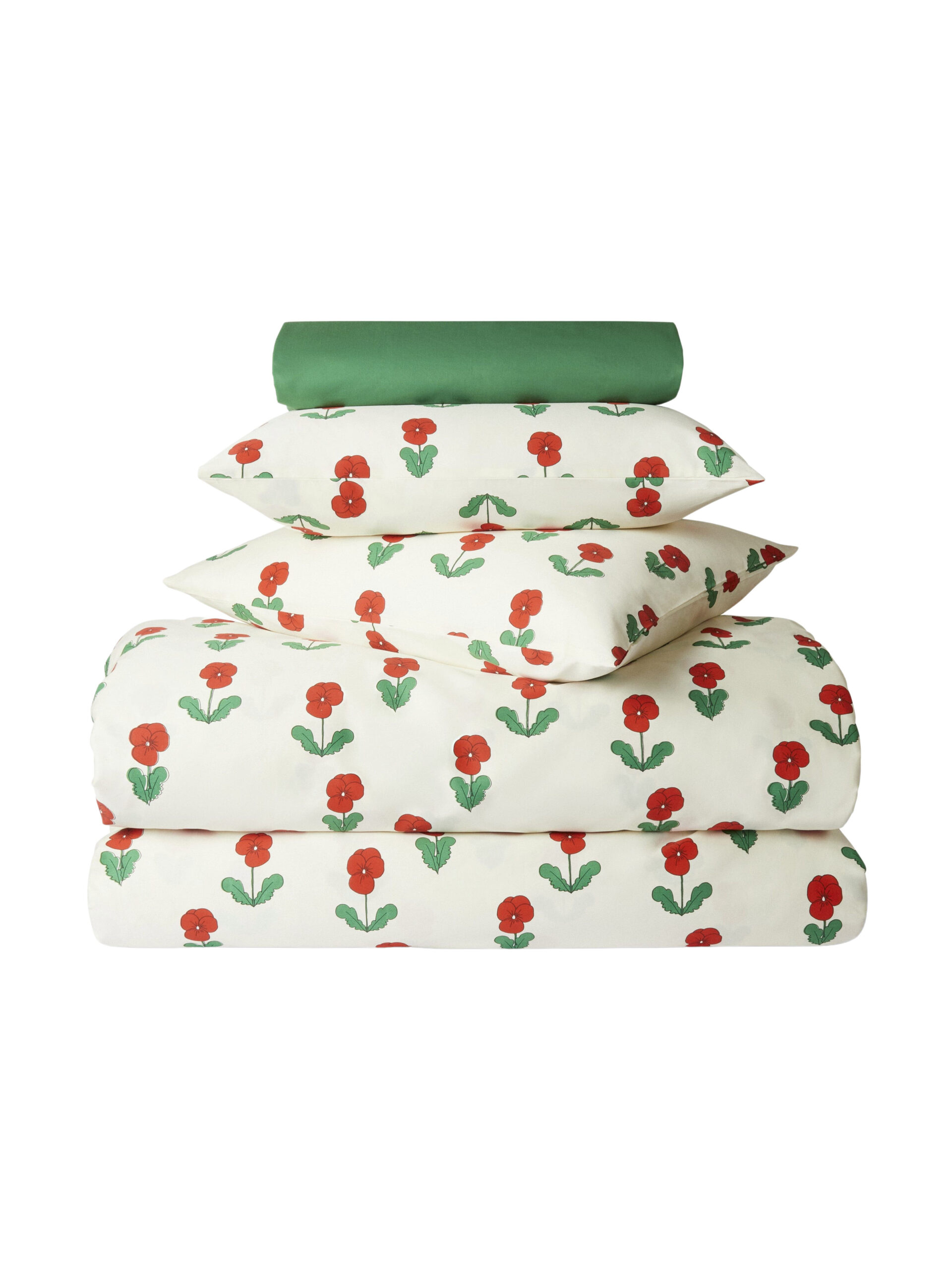
Bedding, £220, Mini Rodini
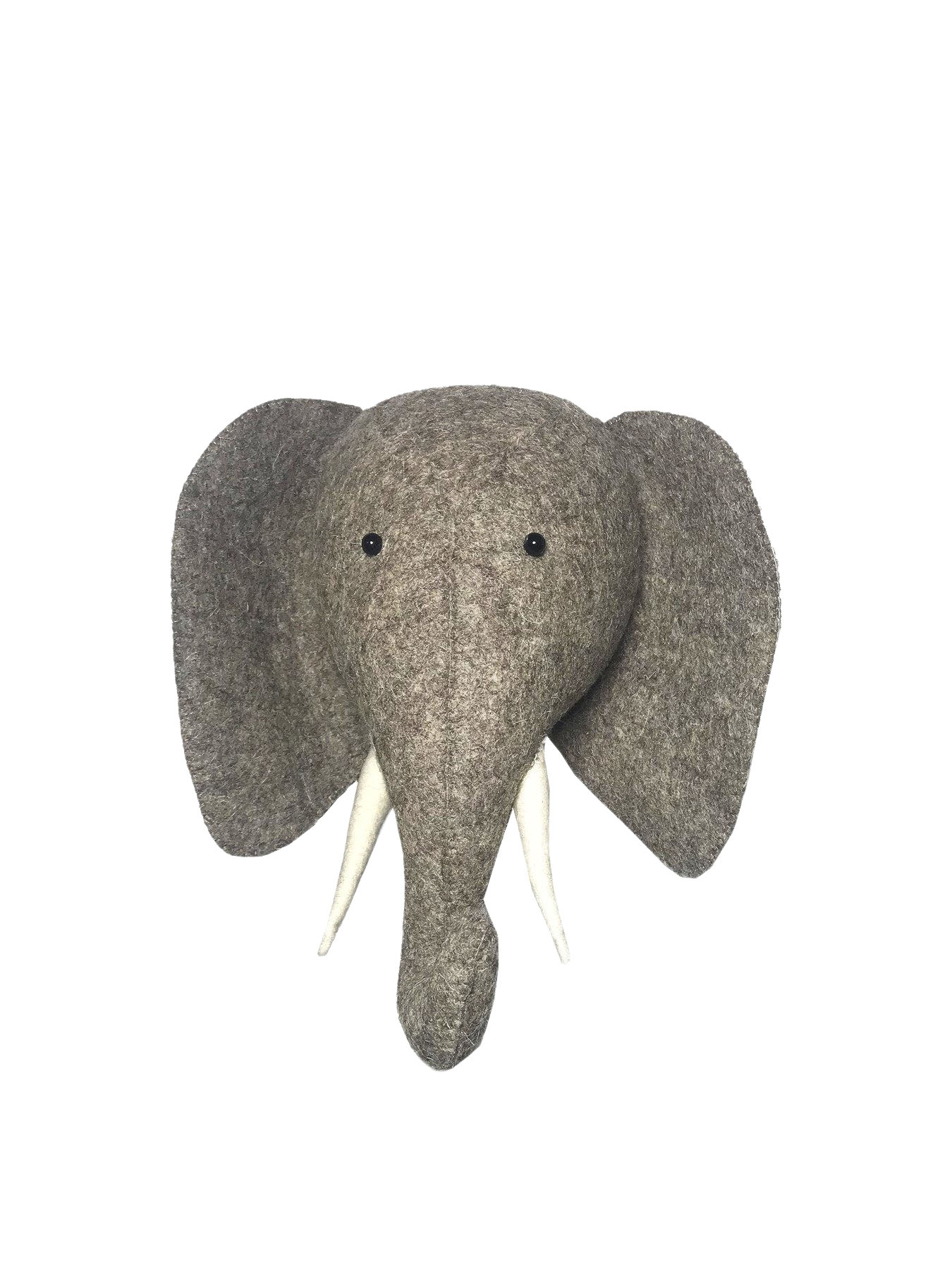
Elephant head, £49, Fiona Walker at Fenwick
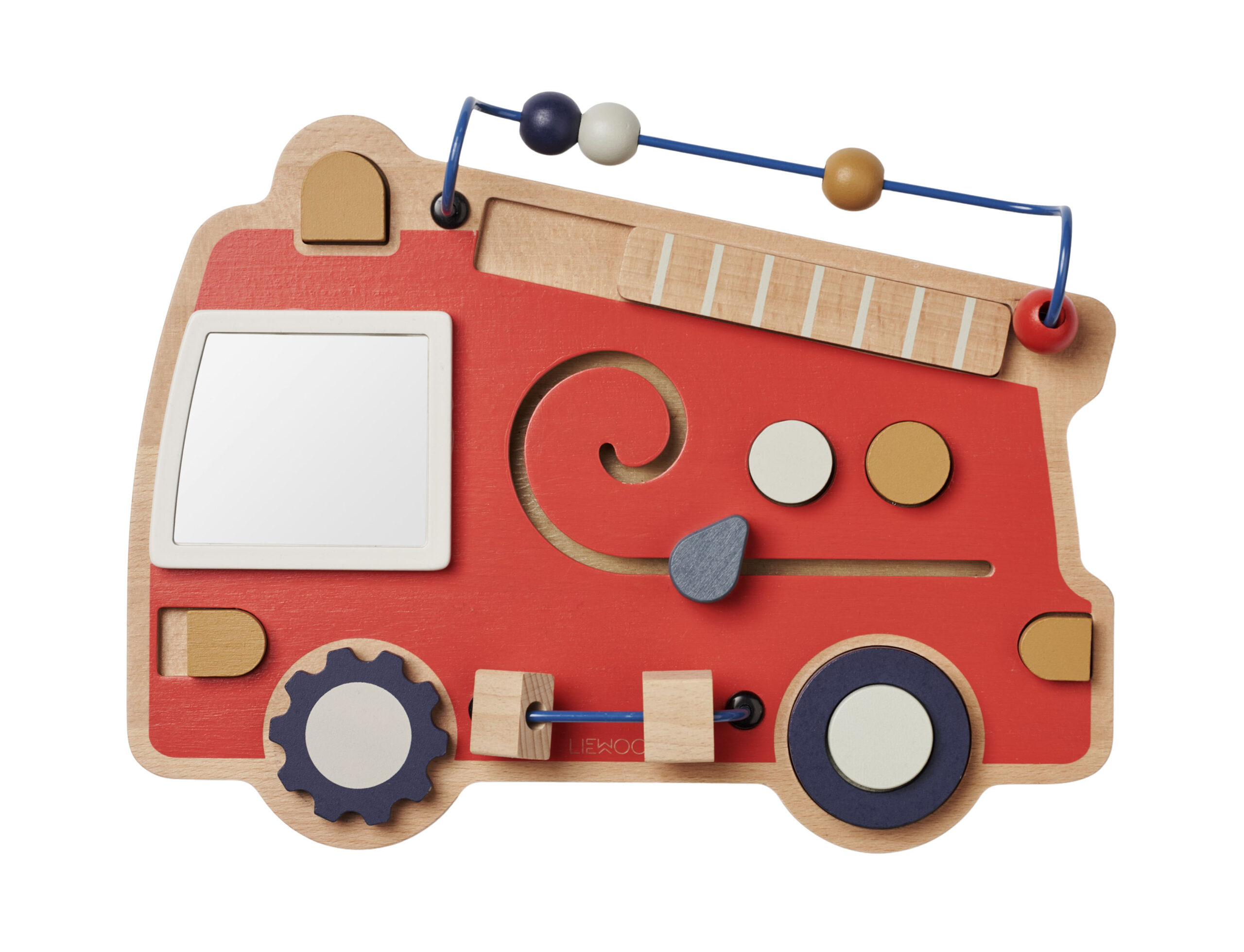
Play board, £34.99, Liewood at Small Kins
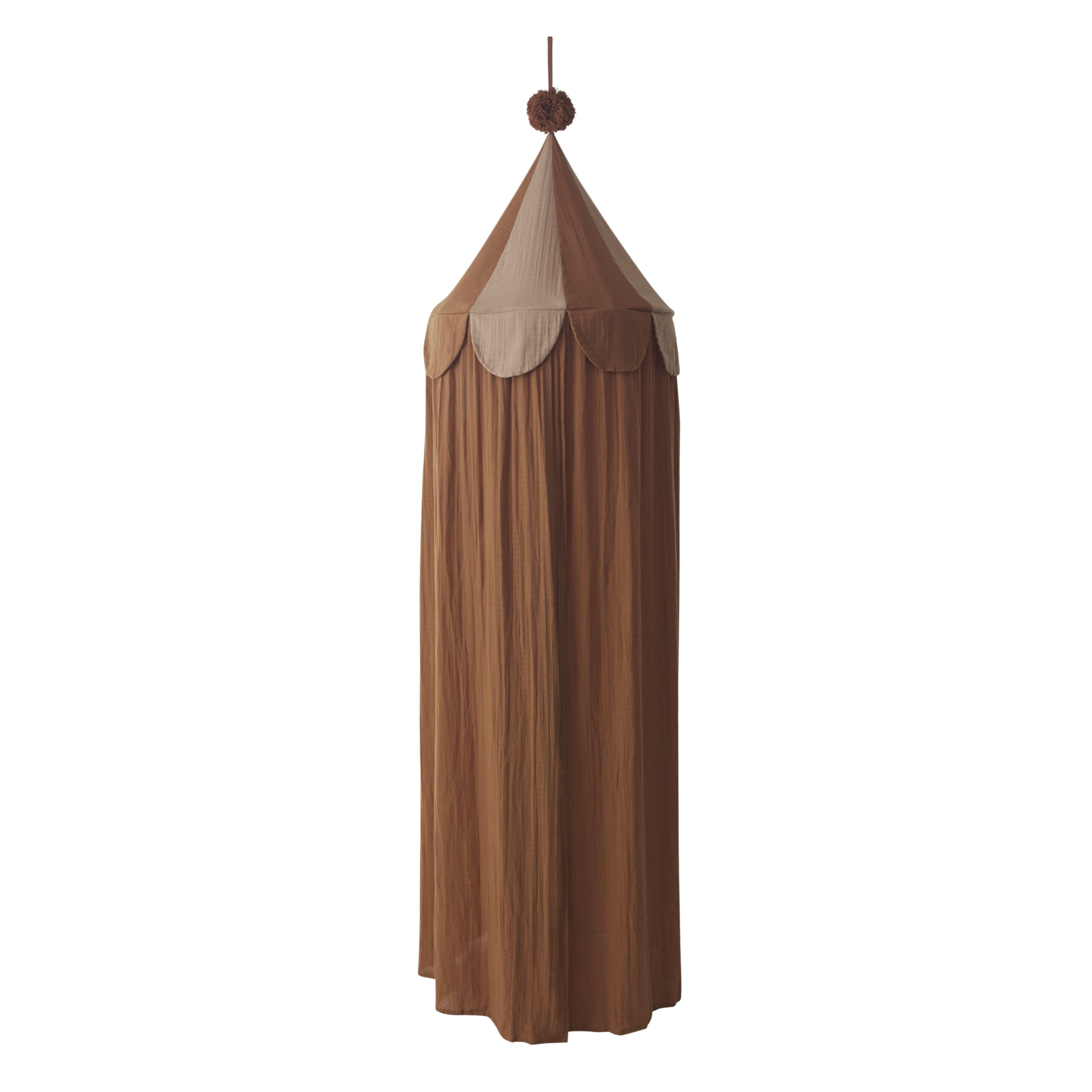
Canopy, £115, Oyoy
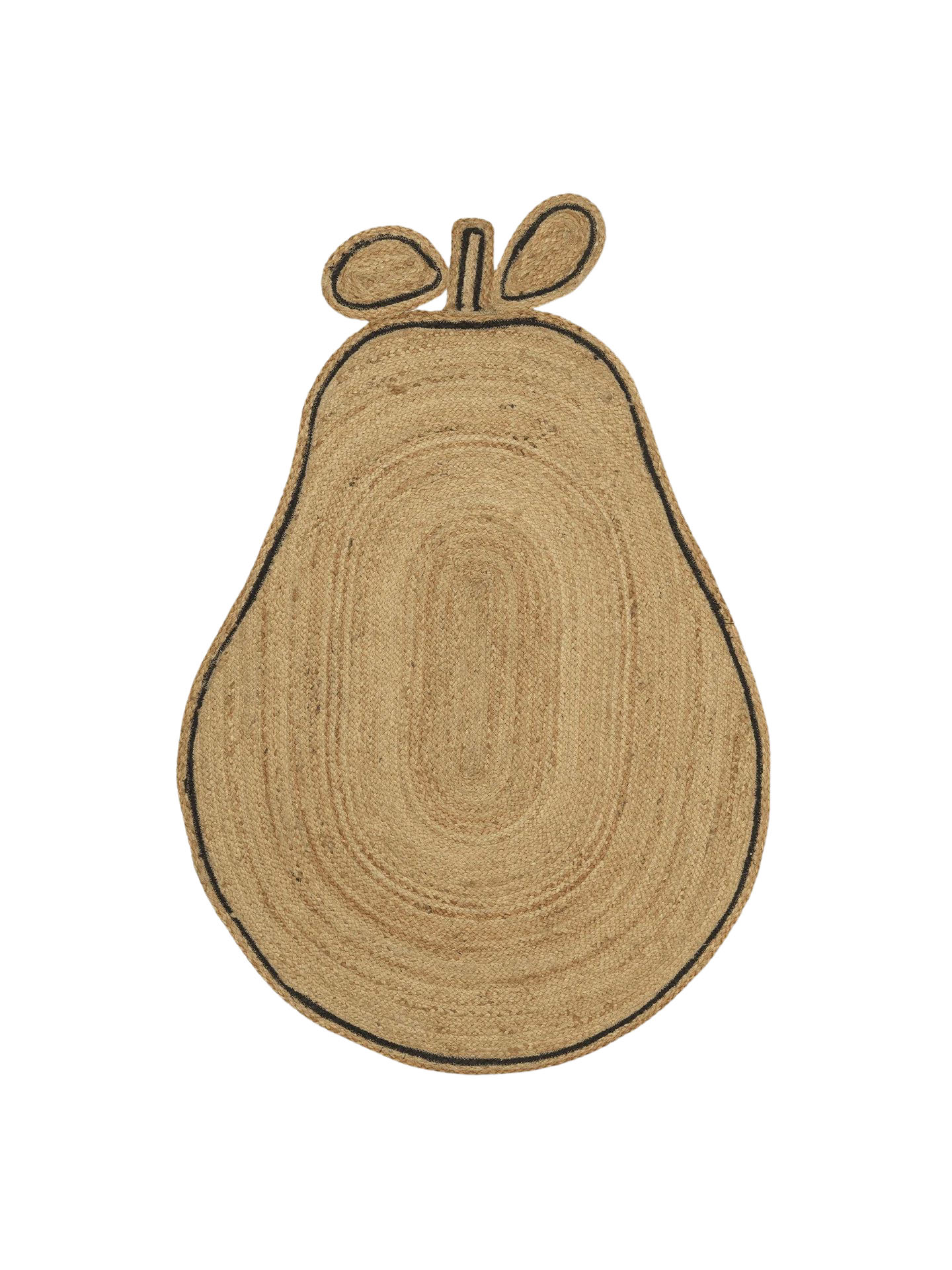
Rug, £109, Ferm Living
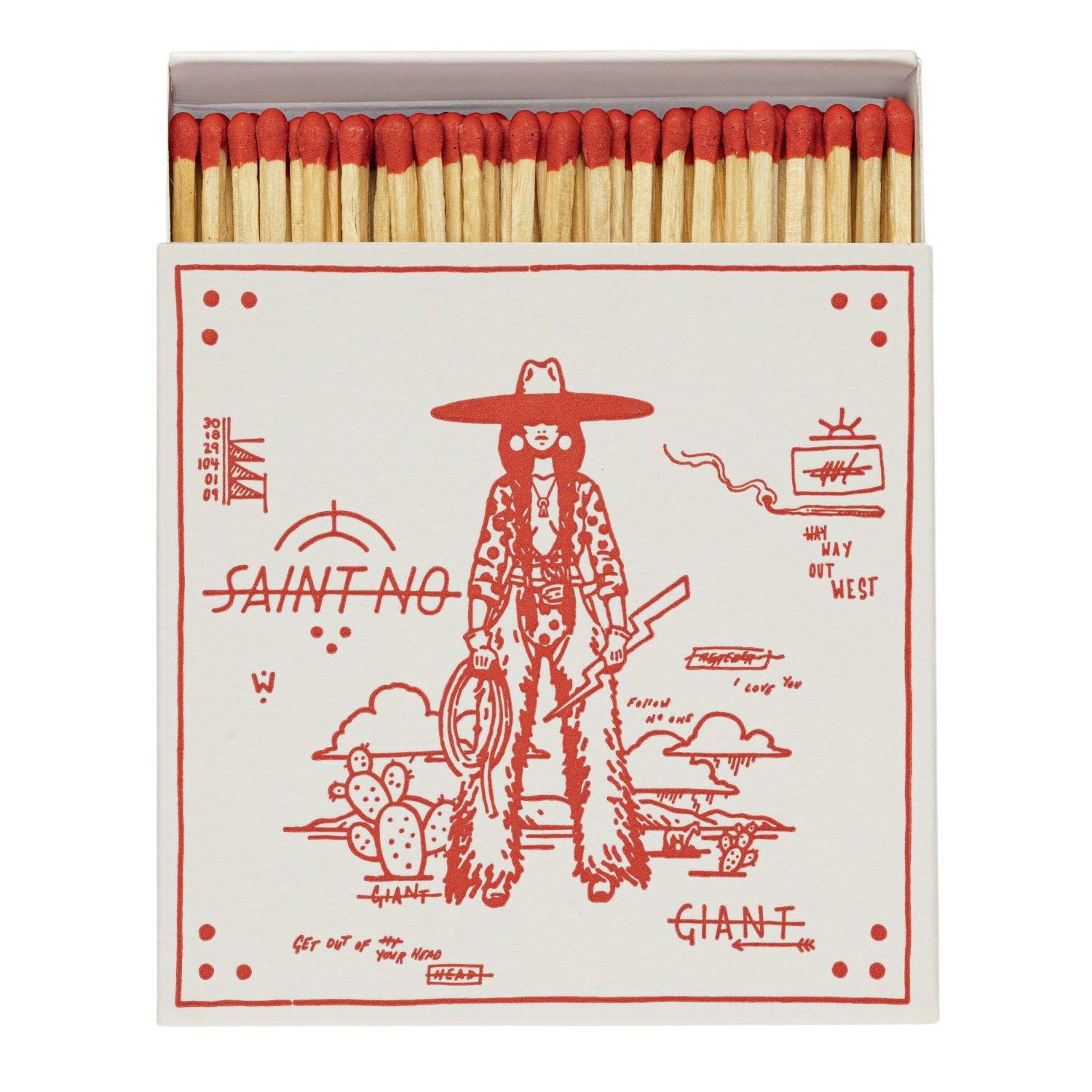
Lightning Bolt, £8, Archivist Gallery
14. love match
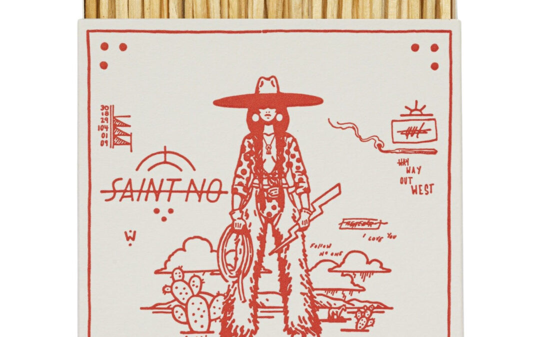
Disappointed to light your gorgeous, scented candle with an ugly box of matches? We feel your pain. But rejoice, because the trend for decorative matchboxes means it’s now oh-so easy to match a box to your favourite candle – and they’re long enough so you won’t burn your fingers. Archivist Gallery is a go-to for its eye-catching retro motifs, but there are now arty ones, boho ones, graphic ones… Perfect for curating a stylish still life, too.
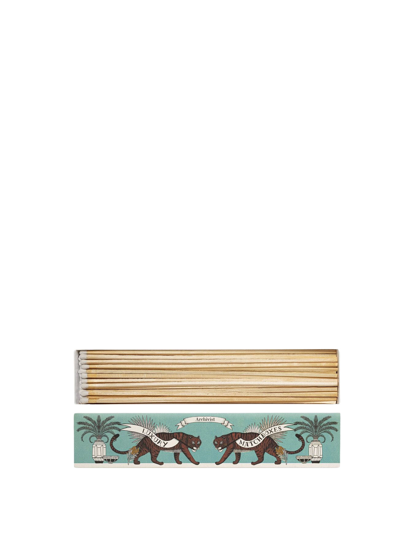
Tiger, £10.50, Archivist Gallery
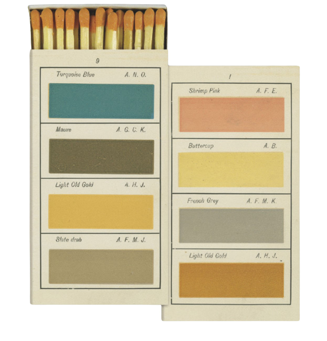
Painter’s Palette, £5, Native Poppy
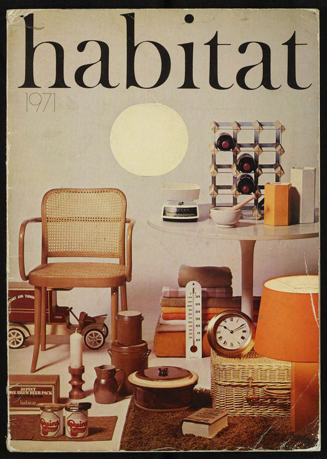
15. 60 years of Habitat
It’s been six decades since Terence Conran opened the first Habitat store – and changed how we shop for interiors forever. Since that shop opened in 1964 on London’s Kings Road, Habitat’s high-low approach, mixing high-design chairs with Moroccan carpets, set the diktat for how we’d dress our homes. For its big birthday, Habitat has reimagined some of its most iconic products – from the Scoop chair to Bobby lighting – and collaborated with stalwarts of the design scene and up-and-coming names on a new collection.
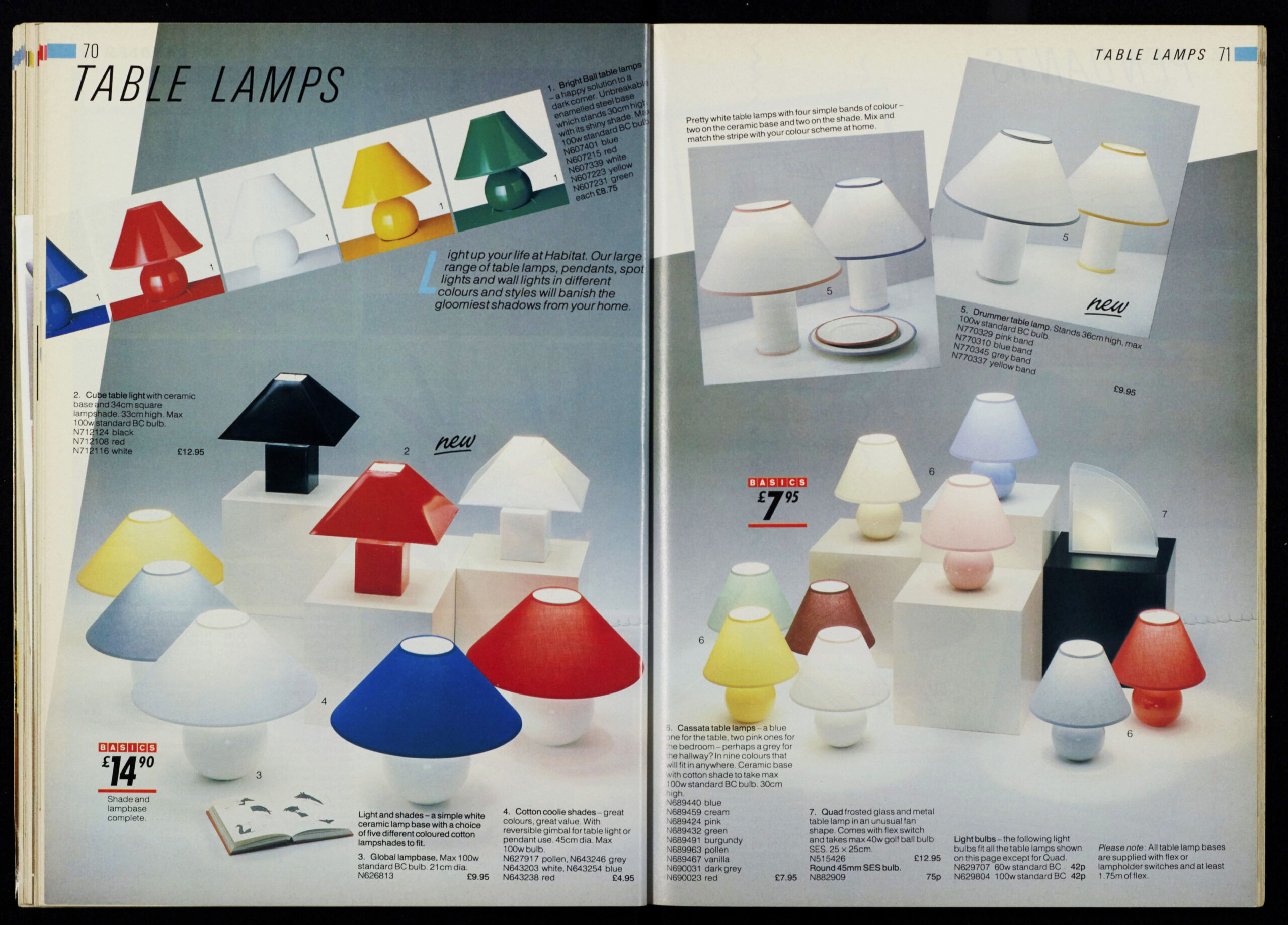
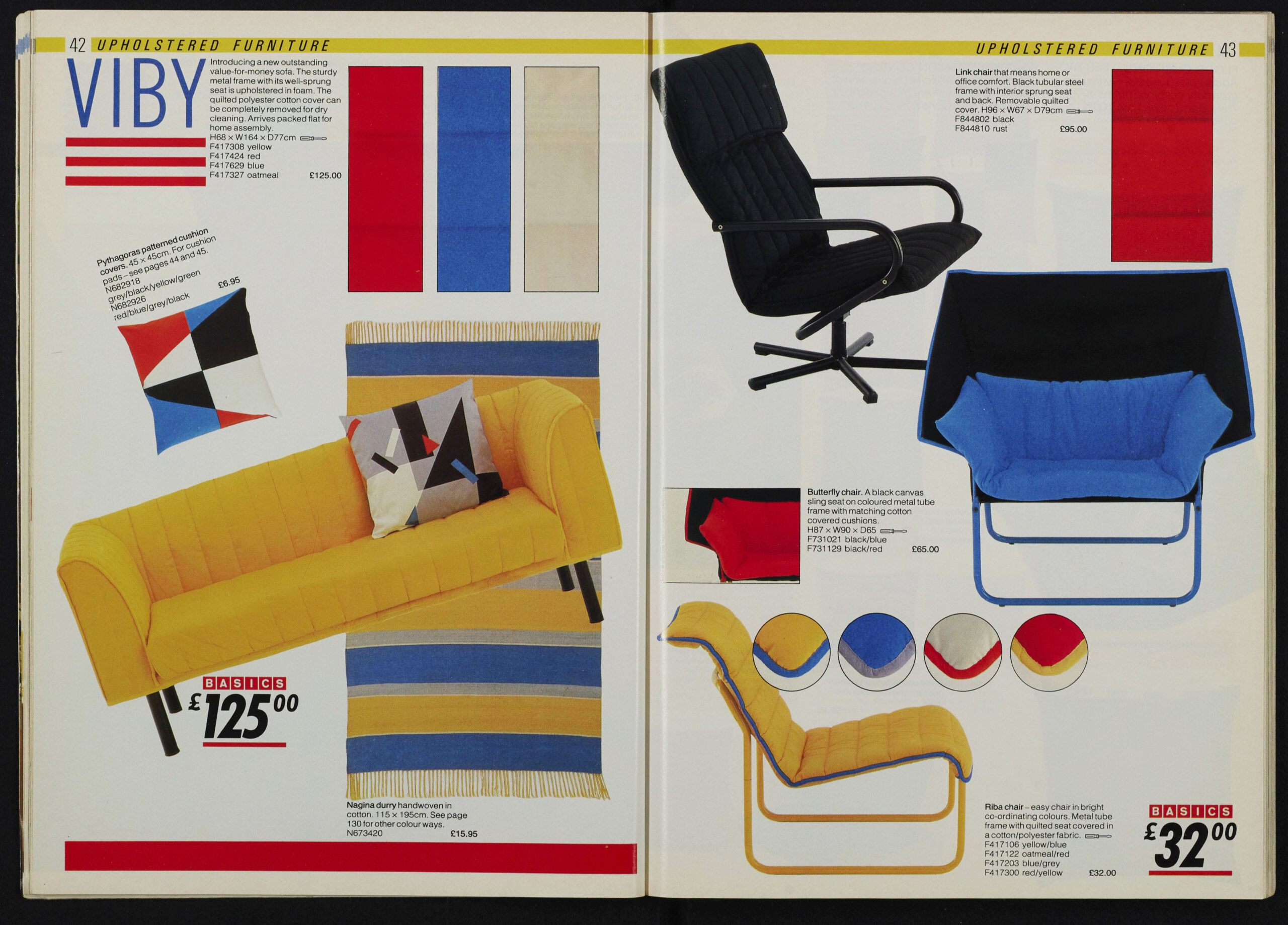
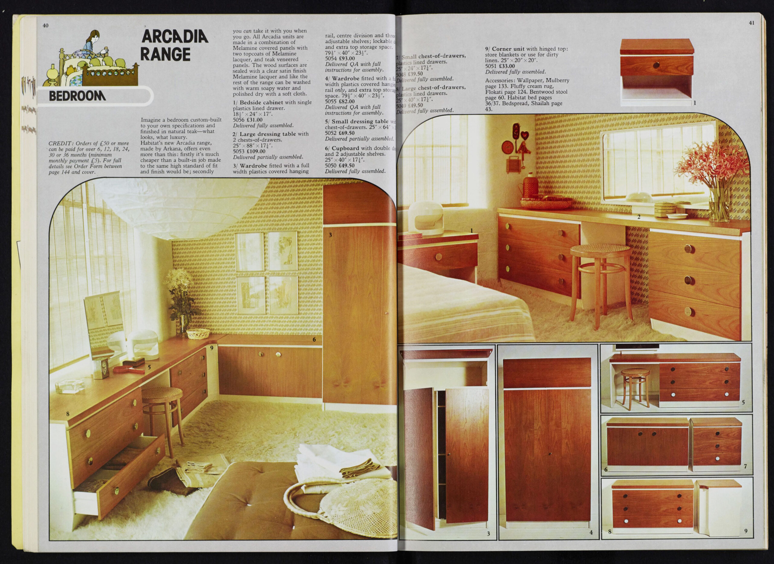
WORDS: Jane Mcfarland, Rachel Loos, Henrik Lischke. The Heirloom Collection by devolkitchens.co.uk, Maxime Verret, Emily Stratton, Catalogues commissioned by Habitat (1971, 1974, 1985)/Images owned by J Sainsbury plc

